Emil Rudolf Weiß (1875–1942) was a German type designer, graphic designer and painter. The scope of his work is nicely displayed in a book from 1931 called “Der Schrift und Buchkünstler Emil Rudolph Weiß” from the series “Monographien künstlerischer Schrift”. I’d like to share this with you and photographed most of the pages from this […]
At the 13th Creative Morning in Berlin Erik Spiekermann gives a 20 minute introduction to Type On Screen. Tweet
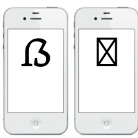
The support for the German Capital Sharp S character (ẞ) on desktop operating systems is already quite good, considering the fact that the Unicode 1E9E was assigned just four years ago and that the need for this character is a pretty local and still controversial subject. On Windows all major system fonts like Arial, Times […]
Graublau Slab is the latest addition to the popular Graublau type family designed by the Berlin-based type designer Georg Seifert. Since its release in 2008, the Graublau Sans Pro typeface has been a popular choice for corporate designs, books, magazines, websites and much more. With Graublau Slab Pro, the type family becomes even more versatile. With […]
An emotional interview with the typographer and type designer Mike Parker about his life and the people he worked with. Thanks to the tdc for making this video! Tweet

You may have already read about the story behind the Wayfinding Sans typeface on I Love Typography and you might have seen the empirical study that proved its outstanding legibility. But now you can also try the typeface free of charge. Just pay with a tweet or Facebook post. (Alternatively there is also a download for a small nominal […]
In a running text in InDesign you could always dump any kind of vector or bitmap images. But handling these objects can be really annoying, since they cannot be edited along with the text. It’s just an object frame which flows with the text. If you want a graphic (like a logo or pictogram) to […]