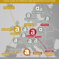
Two years ago I wrote an article with suggestions on how to design a Capital Sharp S (ẞ). Now that over 400 new type families with support for this new character have been released, I thought it would be a good time to review, how the typedesigners have drawn their Capital Sharp S. At first, […]
Capital Sharp S designs. The good, the bad and the ugly.
