Color Emoji in Windows 8.1—The Future of Color Fonts?
Color fonts are by no means a new idea. When Adobe invented PostScript their Type 3 font standard allowed to specify colors within a font and Fontlab’s bitmap-based Photofont technology is also around for years. But the makers of operating systems and apps never really cared about these technologies—until the major success of the Emoji character sets in Asia.

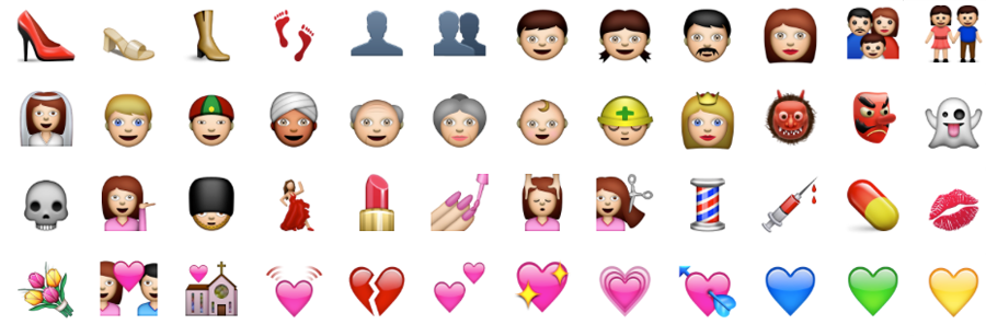
Apple took the lead when they implemented the Apple Color Emoji font in iOS and OS X. It’s a proprietary, unpublished extension of the TrueType/OpenType specification to add PNG images to a font. The single PNG images—one per glyph—are then embedded within running text and can be scaled and copied like regular characters. It was a big hit, especially for the use in messaging apps, and it was no surprise that Apple’s competitors also began to work on color fonts. Google’s solution is very similar to Apple’s (but not compatible) and also uses PNG images. The specification was made public and is now being implemented in FreeType.
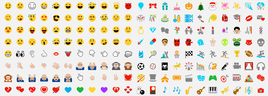
Windows did already support the typical Unicode emoji characters with its Segoe UI Symbol font, but it was a regular TrueType-based font which did not support colors. With Windows 8.1, Microsoft’s operating system now also supports color emoji. But they did it in a very different way than Apple and Google. Instead of using PNG images, they introduced a support for layered vector glyphs!

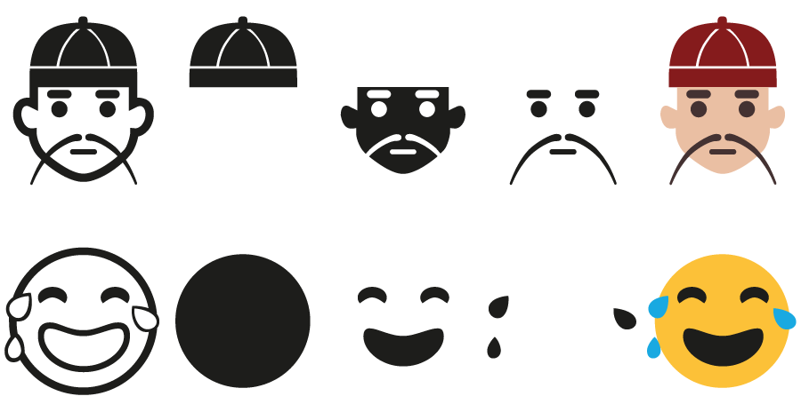
By default, the new Segoe UI Emoji font behaves like a regular TrueType/OpenType font. It has Unicode-encoded, uncolored “base glyphs”. But there are two additional tables in the font: the COLR table links additional glyphs as layers to the base glyphs and defines the order of these layers. And the CPAL (“Color Palette”) table stores one or more color palettes for the individual layers. (The different color palettes are useful for displaying the font on dark and light backgrounds.) So when there is support for this new color feature, the base glyphs will be replaced with the colored layers.

I must say, I really like this approach. The main reasons are:
1. It’s fully backwards-compatible. We recently released our Wayfinding Sans Symbols font which also allows colored icons—in this case through OpenType position of several glyphs. But it’s a hack and not a robust solution. It’s okay to use it in an app like InDesign, but it’s hardly useable in other situations, like on the web. When there is no proper OpenType support, the layers would just be displayed beside instead of on top of each other and copy & paste would also not work properly, since each character consists of several other encoded characters.
Microsoft’s color font approach doesn’t have these problems. One could instantly start using such a font. If you use webfonts to display icons on a website, you could now even use colored icons. If the browser/operating system wouln’t understand the new color tables, the icons wouldn’t be missing. It would just show the base glyphs without colors. And if there is support for the color feature, it could use the included color palette or alternative colors specified via CSS.

And there are hundreds of layer fonts, which currently require the user to create several text frames, style them separately and place them exactly on top of each other. Again, something you can hardly do on the web, where you don’t have full control over the text flow. Microsoft’s solution would make it possible to easily use such fonts on websites, in apps or ebooks.
2. It’s easy to create. Type designers have a certain workflow and they use certain tools. Maybe Photofonts never took off, because its just such a different technology that is not compatible to the way type designers usually work. But putting additional glyphs in a font, that represent different layers of a character, is very easy. And it’s also very easy for the software developers of font editors to add the support for the COLR table which links these glyphs.
Now we have to wait and see if other software makers are willing to adopt this technology. It they don’t, the COLR and CPAL table will just be Microsoft’s own solution to render emoji and maybe also interface elements. But if other companies would adopt it, it could quickly become a standard way to display colored glyphs in multiple environments. I am all for it!
(Yes, I am aware of the ongoing effort to bring SVG to OpenType)

I couldn’t agree more. Though bitmaps can be scaled a bit, they can’t be printed cleanly and certainly won’t be appearing on signs and posters, and the lack of backwards compatibility is daft.
If they just added the ability to interpolate between particular layers they could then approximate the kind of smooth shading the bitmaps enjoy. That could be a further backwards-compatible extension!
Brilliant — it’s a very simple and clean extension to the standard, without introducing weirdness like Apple did. I expect it’d be easy for implementers (like, say, Freetype) to take advantage of too.
Thanks for writing Ralf. This sounds like a great approach to icon fonts. It is great to see that Microsoft is finally starting to innovate with their new OS’s and with IE as well
Here’s me hoping there won’t be a stupid battle (as there always is) between companies pushing for their own implementation.
@caleb: concerning font formats, microsoft has been more innovative than apple for quite a while – be it opentype alone.
@tom: Well, actually, Apple had developed a sophisticated smartfont technology (GX/AAT) before Microsoft.
Does that mean we’ll stop seeing those nonsensical ‘J’s disappear from our emails courtesy of Outlook?
I’ve been trawling the internet to find who actually owns the copyright to the images… using code is one thing, but a company interested in reproducing the images is another correct? I’ve seen people sell these images on hats and shirts and curious as to who is able to license and where they got it from… thoughts?
The images are included in fonts and those fonts are licensed along with the Windows (Segoe UI Emoji) and Mac (Apple Color Emoji) operating system. If you own a legal copy of these operating system for a specific machine, you can create design work on it, including products for sale. After all, the fonts are included to be used.
Thanks for the article. I have a few questions: would you be able to change the color of the layers? You mentioned having two variants of a glyph: one for dark backgrounds, one for light. How will be determined which one will be shown, and would you be able to do this on the web with CSS?
I can imagine icon sets, like emoji, to get away with one or two predefined color sets, but for full color fonts you’d want to be able to change the color yourself. Like in the “LAYERED” text in the image, what if I want red letters with black sides, purple lines and yellow shade?