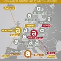
I started to design this infographic for a conference talk about European road signage typefaces, but I thought this might also be useful to share with everyone. Tweet
Typography
I started to design this infographic for a conference talk about European road signage typefaces, but I thought this might also be useful to share with everyone. Tweet
After 6 years, I am happy to announce, that Wayfinding Sans Pro has now been released. You can read all about the development of this typeface in this article on I Love Typography: The Design of a Signage Typeface. Also check out the PDF specimen for more information. Wayfinding Sans Pro is available at fonts.info […]
It seems to be common knowledge among graphic designers: When you need a legible font, pick one with a large x-height! Here are Bernhard Modern (left) and Adobe Garamond (right) set at the same cap height: Adobe Garamond is certainly more legible, isn’t it? And this is even more important for signage. So here is […]
At the University of Applied Sciences Berlin an empirical study was conducted by Sven Neumann to test the legibility of nine typefaces, including my own Wayfinding Sans typeface. The use of type in this study was based on the recommendations of the German legibility norm DIN 1450. This ensured that the study reflected a real-world […]
Usually, when I do my road trips to take pictures of road sigs for my collection, I am most interested in, how these signs look from the driver’s point of view. But now and then I also get out of the car and take some more interesting photos. Here are some selected images from the […]

In the German Democratic Republic (GDR) the road traffic regulations were revised in the 1970s. The GDR had signed the treaty of the Vienna Convention on Road Signs and Signals (1969) and in the years 1974 till 1978 the official norm for the design and content of road signs was changed significantly. The new, quite remarkable layout also […]
Top Gear’s Jeremy May talks to Margaret Calvert, who, along with colleague Jock Kinneir, designed many of the road signs used throughout Great Britain. (You might skip the first 2 minutes of the video to directly jump the interview with Margaret Calvert.) Tweet