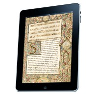
The goal of e-codices—Virtual Manuscript Library of Switzerland is to provide access to all medieval and selected early modern manuscripts of Switzerland via a virtual library. At the moment, the virtual library contains 981 manuscripts from 42 different libraries. The virtual library will be continuously updated and extended. And now you can also browse this […]
Archive by Author
Typography on Instagram
You are on Instagram and you like typography, calligraphy and lettering? Here are some accounts you might want to follow. (Click on the images to get to the Instagram accounts) Andy Clymer, Type designer from New York Hand-painted signs made by Best Dressed Signs from Boston. David Wolske David Wolske runs the wood type […]
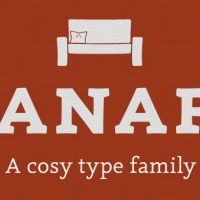
Canapé—a cosy typeface
Canapé by Sebastian Nagel is the latest release at fonts.info. It is based on the idea of letters with a subtly curved and slightly modulated line. Through this, the typefaces has a warm and friendly, almost haptical appearance which brings some kind of cosiness to your communication with type. Canapé Serif with its 4 fonts […]
The Capital Sharp S in Use
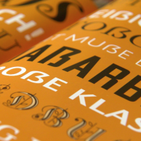
A while ago I announced on Twitter, that it is now 5 years since the Capital Sharp S was added to the Unicode. I was asked, if it has actually been used somewhere in real world situations. A valid question! A new character shouldn’t just be made to look good in type specimen brochures. So […]
Skyfall—Urban Calligraphy by Simon Silaidis
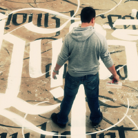
Simon Silaidis applied his life’s love of calligraphy in the rural, urban and suburban surroundings of Asia and Europe. You will spot his work in abandoned places, in the streets and in his studio using ink and bamboo pens. His style is a mix of Western, Asian and Arabian calligraphy and his vision of a […]
From signs to minds—Can cartographic signs be superior to regular direction signs?
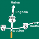
In a scientific study, Michaela Skiles from Middlebury, Vermont has tested, if simplified maps on signs could not only get people to their destination, but also help them to construct a better mental map, which would improve the understanding of the surrounding and help with orientation and navigation in the future. In this guest article, […]
“The Geometry of Type”, 100 typefaces explained by typographer Stephen Coles
If you enter the field of typography today, you are very likely overwhelmed by the diversity of the available typeface. You can choose from over 20.000 type families at MyFonts alone. How should one ever get to understand the differences in style and quality and learn how to chose the right typefaces for a certain […]