Traffic Sign Typefaces: Dansk Vejtavleskrift (Denmark)

Denmark is very generous with colors. Road sign can be red on white, white on green, blue on white, black on yellow and white on blue. Red (usually reserved for emergency icons) is the main color, because it is the color of the national flag of Denmark.
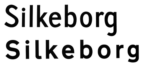
Between 1955 and 1978 a relatively light typeface with large ascenders and descenders was used (see first line in the above image). In 1978 a new typeface was approved by the Ministry of Transport (bottom line). It was taken over from the British Road Alphabet (“Transport”), designed by Jock Kinneir. The Danish letters æ,ø and å were added and a few details were adjusted. For example: the figures were made more open and the spacing was increased.
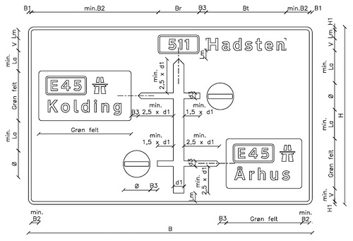
The typeface decides the size of the sign. The size of the typeface (cap height: 25–480 mm) is based on the speed of the cars and technical qualities like contrast and retroreflection. Since there is no condensed style available, signs can get very wide.
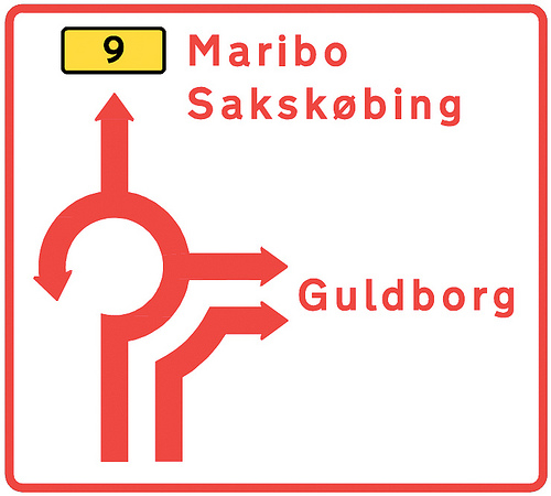
The Dansk Vejtavleskrift is used in two styles: “Positiv skrifttype” (for dark text on light backgrounds) and “Negativ skrifttype” (for light text on dark backgrounds). The latter has increased spacing, but no changes in weight.
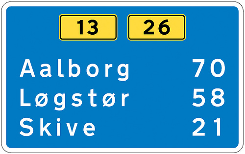
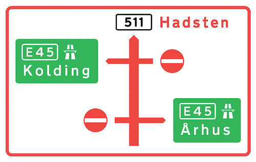
These signs are beautiful! I am in love with their colour combinations.