Traffic Sign Typefaces: Poland
When I first saw a digital version of the Polish traffic typeface, I though I must have gotten a really bad digitization. It had characters which were obviously cut off by mistake …
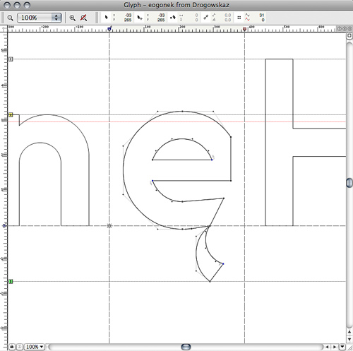
But I later found out that this is the way the typeface is supposed to look like according to the official specifications:
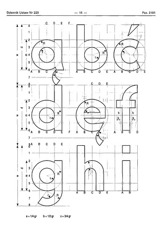
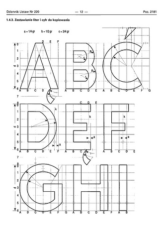
The typeface has a very simple geometric design almost without any typographic corrections. Only one style is in use. There is no condensed style available and no variations for positive/negative contrasts.
The typeface was originally developed in 1975 by Marek Sigmund for the Ministry of Transportation and put into effect on April 1 of that year. It is currently used in accordance with the Ministry of Infrastructure regulation of July 3, 2003 on all types of road signs in Poland.
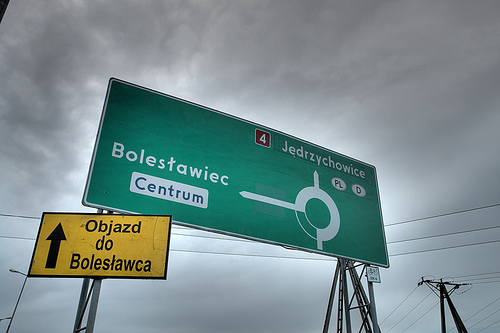
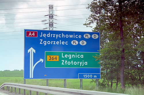
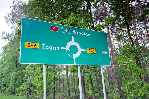
But Poland is a good example that type design isn’t everything when it comes to the design of traffic signs. The Polish signs compensate for the poor type design by making most of the information and direction signs very large, thus still achieving a good legibility.
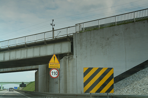
Unfortunately, the typeface almost always fails when the type has to get smaller. See this next example on a motorway, which is supposed to be read at 110 km/h (70 MPH).
There are two digital versions available: Tablica drogowa by Grzegorz Klimczewski and Drogowskaz by Emil Wojtacki. The latter is freeware and I recommend using the TrueType version. The OpenType PS font has some outline bugs.
See also:
- Other traffic typeface articles
- Flickr pool Type on Traffic Signs
I haven’t seen that coming! Nice post, and yes, the typeface used for Polish signs is both—unaesthetic and very limiting.
you might think that the topography has something to do with character of the Polish people.
it could ……
there is nothing more worse than polish signs. most of them are green (easy on eye, too similar with surrounding nature). i had several times to return to sign to see what is written.
I actually like the typo. It looks cool.
This is not about the letters, this is about kerning.
But the typeface itself isn’t economical, indeed…
This font became one of inspiration to swiss typographer Ludovic Balland for identity of new polish art museum in Warsaw. It’s a pity that he saw this font in many place at Warsaw
But I saw very first projects and I think the font designed by Ludowic is much better done than original.
This typo is a joke…Polish ogoneks and cutes are tragic, but it shows exactly state of our public design. Sometimes I don’t know - cry or laugh.
Does this typeface perform poorly using the Legibility Test Tool?
I think this typeface is quite modern and legible, and also has great character (I especially love the “e”) which many designers would find confronting because it doesn’t conform or derive from the bland commercial fonts fashionable these days. I also love the look of this typeface stencilled on countless village entrance signs in Poland. Even with less than perfect kerning, it is very robust and distinctive and should be treasured.
Compared to the examples of other European road signs, which use boring print typefaces that look like they come from the side of a medicine bottle, the Polish traffic sign typeface has much more aesthetic appeal.
Thanks for this article, very interesting as usual!
It was, I believe, reasonably common in the past to make very geometric designs to enable ‘draughtsmen’ to reproduce the lettering manually on signs. That way they could use the tools on hand to make consistent letterforms. In a similar way perhaps, DIN resembled the lettering used by architects on drawing slugs, and could be made with compass and rule.
I suspect this s a similar case?
Compliments on the quality of your photographs Ralf, once again!
Does anyone know the actual name of the polish traffic typeface?
I have the official documents as scans but unfortunately I can’t read them.
Not every road signage typeface has a real name. When its the only typeface used, there is no need to differentiate (thus name) it.
Actually I just found it. It’s called Drogowskaz … There are downloadable testfiles (for none commercial use) available around the internet—they’re highly recommendable if you’re looking for some inspiration.
So few seem to recognize that this typeface is pretty amazing!
I named and linked the digitizations in my article. I thought you were refering to the official name used by the road authorities.
@Ralf … By the way—I’m also on the look for info on a turkish (maybe actually cypres-turkish) roadsign font called Carretera.. Do you happen to know anything about this?
Grzegorz Klimczewski - Tablica drogowa
Emil Wojtacki - Drogowskaz
Originally, this font was simply nameless. It has never been intended to be marketed outside of its original purpose. The name “Drogowskaz” was given by one of the guys who digitized it.
The font was designed for maximum legibility, so aesthetic criteria were not an issue. In fact, Polish traffic signs are readible from quite a long distance. At least this is my personal experience. Its main flaw is its space consumption as the letters are extra-bold, and there is no condensed version available.