Typographic Week 23—Vintage, Poems & Paintings
Poem Script from Sudtipos
Poem Script by Ale Paul is a mixed collection of interpretations conjuring a late nineteenth century American pen script style. Though not an actual Italian letterform, this style was called “Italian Alphabet” stemming from an old penman’s term for an alphabet where the stress or shades are opposite their normal placement. The American variant followed from the late eighteenth century British hand also confusingly called “Italian Hand”, which itself evolved from some seventeenth century French batarde scripts …http://www.sudtipos.com/fonts/148
Here is a beautiful font specimen video directed by Santiago Idelson and with music performed by Rachel Grimes:
Textify it
This browser app turns every image into a typographic painting. I requires Firefox 4/Chrome or you can purchase it in the AppStore. http://textify.it

Type Case
The installation Type Case is a low-resolution display with 125 rectangular pixels of different sizes. These are formed from the reflecting light of digitally controlled LEDs, embedded in each section of a European printers’ type case. Due to the standardized fragmentation of its compartments, the density of visual information is decreased towards the objects’ centre. Viewed close by, it is nearly impossible to recognize more than a flicker – however after moving some distance away, it becomes distinguishable, that the lights and shadows give a representation of the latest headlines.
ScriptSource
ScriptSource is a dynamic, collaborative reference to the writing systems of the world, with detailed information on scripts, characters, languages - and the remaining needs for supporting them in the computing realm. A major goal of ScriptSource is to enable the development of software that supports minority writing systems, including fonts, keyboards, sorting routines and typographic rendering systems. We hope that the site will draw together the design, computing and linguistic communities to meet these needs and increase global multilingual computing.http://scriptsource.org

Wooden Letters
The Etsy shop Vintage Marvels offers quite the selec tion of let ter press wood blocks, from complete alpha bets to sets that are grouped by let ter to short words. Via Designworklife

27 letters
This new hand-drawn creation from artists Giuseppe Salerno and Paco Gonzalez is exactly that, art and typography. 27 letters. 27 distinct typographies. It took more than a month of hard work to complete the entire alphabet. Each letter was created to stand alone, each letter representing a particular style, while at the same time maintaining unity when placed together. The effect is an a eye-popping headline. via Typegoodness
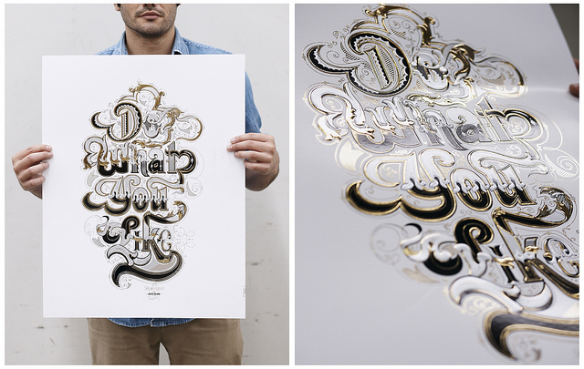
Do what you like
Check out the hi-res version on Flickr …
Storm Type Summer Sale
Till the end of August all font from the Czech Storm Type Foundry are 25 percent off: http://www.stormtype.com

Lignette Script
Lignette Script is an elegant monoline font consisting of 535 glyphs, with a wide range of languages covered (including Greek) and 71 beautiful ligatures. Please make sure to use applications that support OpenType features. The font is currently on sale at MyFonts.
Crescendo from Canada Type
A year after the tremendous success of Memoriam in the “Lives They Lived” issue of the New York Times magazine at the end of 2008, Patrick Griffin and Nancy Harris Rouemy teamed up once more to tackle the same project for the 2009 issue. This time the magazine’s design concept revolved around a typeface they created specifically for custom vertical malleability, and that can play just as well in single- or multi-color environments. The result was another iconic commemorative issue that shows exotic tri-line letters merging, swashing, extending and flourishing in stunning gold, silver and blue on black on the cover, and in black on white on the inside pages. Just like in the previous year, the issue won multiple publication design and typography awards …
http://new.myfonts.com/fonts/canadatype/crescendo/

Christian Schwartz’s authentic Neue Haas Grotesk
The original metal Neue Haas Grotesk would, in the late 1950s become Helvetica. But, over the years, Helvetica would move away from its roots. Some of the features that made Neue Haas Grotesk so good were expunged or altered owing to comprimises dictated by technological changes. Christian Schwartz says “Neue Haas Grotesk was originally produced for typesetting by hand in a range of sizes from 5 to 72 points, but digital Helvetica has always been one-size-fits-all, which leads to unfortunate compromises.” Schwartz’s digital revival sets the record straight, so to speak. What was lost in Neue Haas Grotesk’s transition to the digital Helvetica of today, has been resurrected in this faithful digital revival.
http://www.linotype.com/en/6598/allaboutneuehaasgrotesk.html

No comments yet.