Creating web text that automatically scales to the width of its parent element
You might have noticed, that in my current blog layout all lines of the headline always perfectly match the width of the blog layout, even if the size of the browser window is changed. In case you are wondering, here is how this was achieved …
As type designer I am used to design these typical type specimen pages where sample words and phrases are presented on one line each and they all are scaled so they exactly fill the type area of the page.

In HTML however, this is actually hard to achieve. CSS lets us scale a background image in a DIV to 100 percent, but not text. You could manually size each line, but there is no guarantee you will have a pixel-perfect design in each browser and your layout may even break completely if one line gets slightly larger than expected. And your layout will break for sure, if other fonts of your font stack are used than you intended.
What we actually need is a client-side solution. The text needs to be scaled within the browser using the actual font. So we need JavaScript. You might have heard of FitText.js, but it is only meant to deal with the way the text changes in fluid/responsive layouts. It doesn’t allow you to automatically scale your text to 100 percent of your parent element. But there is another jQuery script that does: BigText.js by Zach Leatherman.
And it’s as simple as this:
<div id="parent-element" style="width: 600px">
 <div>The first line</div>
 <div>The second line</div>
 <div>The last line</div>
 </div>
$('#parent-element').bigtext();
You simply define your parent and child elements (DIV, UL, OL et cetera) and BigText will invisibly run through a series of incremental type size changes to figure out which size does fit in the parent element. You can check out a live demo here, which even works while you type.
If you are using webfonts you need to make sure, that the script doesn’t start before the webfonts are fully loaded. Otherwise the scaling will be based on a system font instead and the layout looks broken when you load it for the first time.
Depending on the fonts you are using, you might also experience another version of the FOUT—this time a “Flash of Unscaled Text”. So you might want to use the Google Webfont Loader to hide the text until the webfont is loaded and scaled properly.
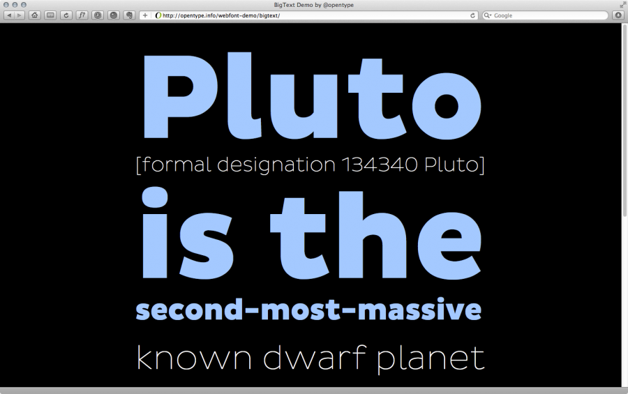
Here is a demo I created using the new Pluto Sans typeface by HVDfonts. None of these lines have any font-size settings. It’s all handled automatically by BigText.
Try resizing the demo page! It will automatically adapt.
Live Demo BigText page Download at github Pluto Sans (MyFonts)

Yes, the image automatically, um, adapts
http://twitpic.com/a443mf
Does this also work, when the parent element has a percentage based width?
Thanks for sharing
That is pretty sweet! Thanks for the share.
While reading the note about CSS background scaling I guessed that maybe an SVG inline image can also work without using Js. To be tested…
Any direction on how to include this for wordpress? its not working for me.
@Cory: Check the source code of this blog. I use it.
@Ralf, I got it working after a couple hours. I needed to call the script in my php file using jQuery(document) instead of using ‘$’. Classic. (http://www.mkyong.com/jquery/jquery-is-not-working-in-wordpress-solution/) But after I got it working, it didnt work for my page, unfortunately. Thanks for the follow up