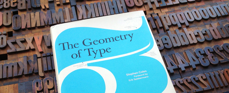
The Geometry of Type: 100 Typefaces by Stephen Coles
If you enter the field of typography today, you are very likely overwhelmed by the diversity of the available typeface. You can choose from over 20.000 type families at MyFonts alone. How should one ever get to understand the differences in style and quality and learn how to chose the right typefaces for a certain job?
You need to start somewhere. Beginners often ask about the “essential typefaces” one needs to know or needs to have. But which typefaces are the essential ones? The classics from the era of metal typesetting? The bestsellers of today? The most promising newcomers? There is no simple answer.
It is helpful to have a teacher who knows the font market through and through—someone like Stephen Coles. He was a creative director at FontShop San Francisco and is known for his typography blog Typographica. A recent project he started together with Sam Berlow and Nick Sherman is Fonts in Use.
In his book “The Geometry of Type” Stephen Coles takes a look at the anatomy of 100 essential typefaces. The book starts out with some background information about type terms and type classification. But these parts only cover around 20 pages …
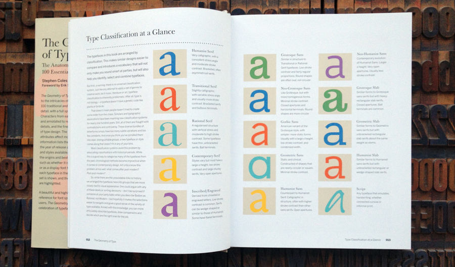
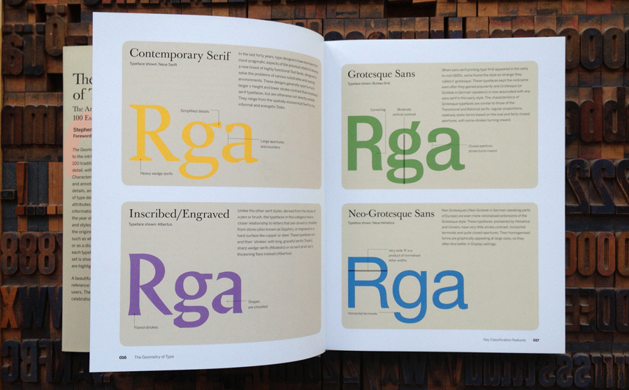
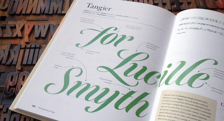
The rest of the book will look like the spread on the following picture. Typefaces from all classification categories are introduced on two pages each.
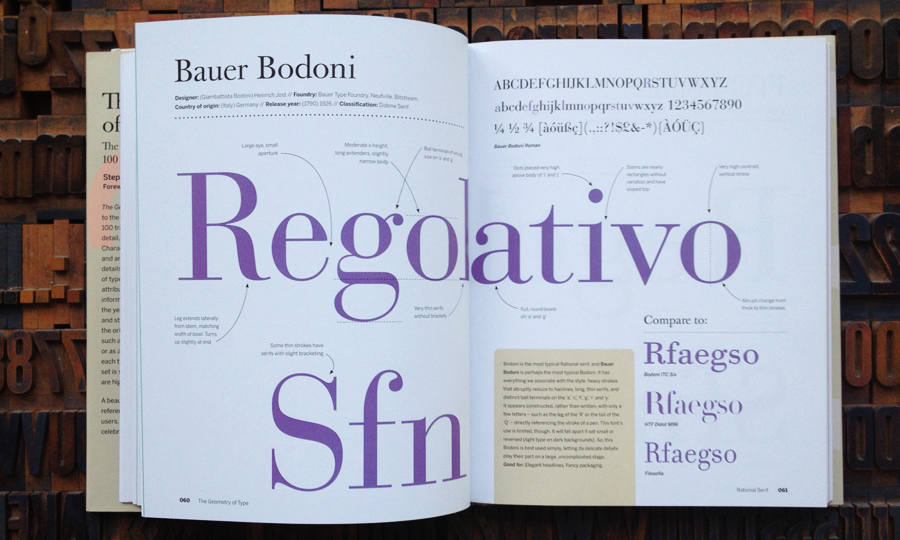
A short description text will give you background information about the creation of the typeface and what a recommendable use for it would be. The special features of the type design are explained using large annotated type samples.
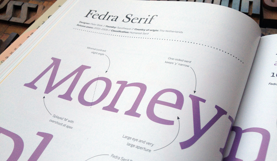
The book is easily accessible to anyone with an interest in typography. It’s not a textbook with long copy texts, but you will definitely learn a lot about the tiny details of type design and why they are matter when choosing a typeface for a certain project.
The 100 typefaces introduced in this book are:
- Adobe Jenson, Cala, Bembo Book, FF Clifford, FF Scala, Lexicon, Minion, Garamond Premier, MVB Verdigris, Adobe Caslon, Baskerville Original, Mrs Eaves, Plantin, Arnhem, Times New Roman, Le Monde Journal, Bauer Bodoni, ITC Bodoni, H&FJ Didot, Filosofia, Farnham, New Century Schoolbook, Miller, Eames Century Modern, Ingeborg, Melior, Neue Swift, Skolar, Fedra Serif, FF Meta Serif, Doko, Luxury Diamond, Albertus, Modesto, Trajan, Berau Grot, Knockout, FF Bau, Univers, Neue Helvetica, Akkurat, National, Antique Olive, Bell Centennial, News Gothic, Benton Sans, Whitney, Futura ND, Avenir, Gotham, ITC Avant Garde, Calibre/Metric, FF DIN, Interstate, Verlag, Klavika, MVB Solano Gothic, Forza, Gill Sans, FF Yoga Sans, Frutiger, Myriad, Verdana, Syntax, Cronos, TheSans, Auto, Optima, Beorcana, FF Meta, Amplitute, Fedra Sans, FF Dax, FF Balance, Giza, Clarendon, Farao, Heron Serif, Archer, Neutraface Slab, Rockwell, PMN Caecilia, FF Unit Slab, Adelle, Freight Micro, Kinescope, Studio Slant, Radio, Bickham Script, Tangier, Suomi Hand Script, Nitti, Ed Interlock, Bree, Rumbe, Trade Gothic Condensed Bold No. 20, Heroic Condensed, Cabazon, SangBleu, Marian
It’s a mix of classics, popular fonts of today and some typefaces which are probably just personal favorites of the author. After you have read the book, you will not have a complete overview of today’s font market—there are hundreds of other noteworthy typefaces out there. But you will have learned what details matter, how they relate to each other and what characteristics and features you will have to look for in each type category. And that’s a great starting point to explore the exciting world of fonts further.
- The Anatomy of Type: A Graphic Guide to 100 Typefaces
- Stephen Coles (Author), Erik Spiekermann (Foreword)
- Hardcover: 256 pages
- Language: English
- Product Dimensions: 9.9 x 7.8 x 1 inches
- US version (“The Anatomy of Type”): Harper Design, ISBN-13: 978-0062203120
- UK version (“The Geometry of Type”): Thames & Hudson, ISBN-13: 978-0500241424
Thanks for the overview, Ralf. I’ll be posting some thoughts about the typeface choices at the book’s official site soon. The main goal was introduce beginner to intermediate designers to contemporary type by splitting the selection in half: with about 50% common and mainstream names and 50% fresher and lesser-known typefaces (that are just as useful, if not more so). This way there are easy points of comparison between the familiar and new.
This book is on the market with two different titles: “The Geometry of Type” and “The Anatomy of Type”.
Thomas, there are indeed two titles, and I wish there wasn’t, but they aren’t intended for the same market. “The Anatomy of Type” is published by Harper Design in the US only. “The Geometry of Type” is published by Thames & Hudson in the UK and Europe.