Looking forward to the release of that documentary … Tweet
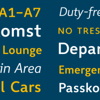
After 6 years, I am happy to announce, that Wayfinding Sans Pro has now been released. You can read all about the development of this typeface in this article on I Love Typography: The Design of a Signage Typeface. Also check out the PDF specimen for more information. Wayfinding Sans Pro is available at fonts.info […]
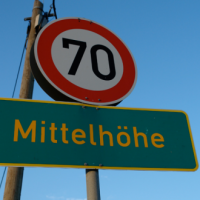
It seems to be common knowledge among graphic designers: When you need a legible font, pick one with a large x-height! Here are Bernhard Modern (left) and Adobe Garamond (right) set at the same cap height: Adobe Garamond is certainly more legible, isn’t it? And this is even more important for signage. So here is […]

“Why Type Designers and Web Designers are Incredibly Similar and Should Really Get a Room Already.” (Webstock ’12) Tweet
In this 20-minute talk at Creative Mornings in Berlin Nadine Roßa talks about her favorite letter: the German ß. Tweet

Next week, it will be exactly four years since the Capital Sharp S was added to the Unicode specification. Within that rather short period of time, it … has been added to over 170 new type families included in the main typefaces of the world’s most used PC operating system Windows and office suite recommended […]
If you have an iPhone you probably use and love Instagram. But if you also love type and typography, you need to check out fontli. It provides basically the same functionality as Instagram and is supposed to be used the same way—just that it only focuses on type and typography. Just like on Instagram you […]