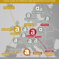
The typeface on the traffic signs of Norway is called Trafikkalfabetet and was designed in 1965 by Karl Petter Sandbæk.
Traffic Sign Typefaces: Trafikkalfabetet (Norway)
Typography
The typeface on the traffic signs of Norway is called Trafikkalfabetet and was designed in 1965 by Karl Petter Sandbæk.
“Job and Gradus are both ambitious concerning letters”. Watch the two brothers writing the alphabet with a brush. A wonderful piece about the development of the personal handwriting. http://www.xelor.nl/
keming. noun. The result of improper kerning. A fantastic idea by David Friedman. (via FontBlog)
Harmonie Intérieure offers large typographic stickers which you can easily put on your walls. You can choose from 58 colors to match your interior design.
Collecting rare specimen books from type foundries can be a really expensive hobby. Luckily there is a growing number of digitized type specimen books available online. The Open Library project offers a free and enjoyable way to browse in those books. The magnifying glass isn’t working yet, but you can download most of these type […]
TYPEmatch(mak)ing, originally uploaded by www.typografie.info. Send two of six well-known typefaces on a date and see if they are a match: http://blog.extensis.com/typecaster/ (Via Typblography)

In general I love how the internet makes it possible to spread information and ideas around the world. For example, some shows on TED can be a real enlightenment. But I get very annoyed when wrong claims become common knowledge just because they were blasted all over the internet. My two “favourite” stories of this […]