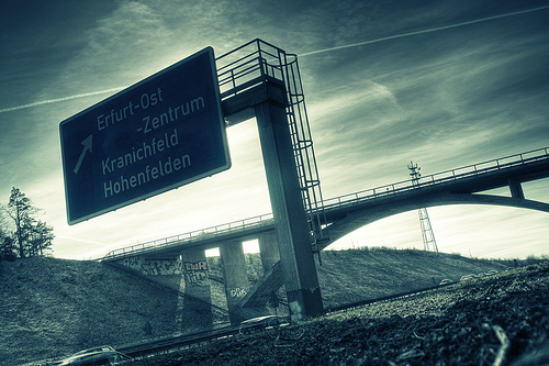
Traffic Sign Typefaces: DIN 1451 (Germany)
The official traffic typeface in Germany is called DIN 1451 and has a very long history …
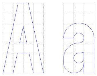 It goes back to the beginning of the 20. century when the Royal Prussian Railways (Königliche Preußische Eisenbahn) defined a new master drawing for the lettering for the description of freight cars, The typeface was later adapted for all kinds of signages of the German railways. In the 1920s major German industrial companies met to agree on all sorts of technical standardization including type standards. The result was called DIN 1451 and was based on the railway typeface. The typefaces were created on a very simple grid system and with a continuous stroke width. The type norm was published in 1936 and became a standard for traffic signs, road signs, street names, house numbers and license plates. Over the next decades the typeface also appeared on all kinds of goods and household articles, making it THE German typeface.
You can read the full story of the history of the DIN typeface in a series of articles by Albert-Jan Pool (designer of FF DIN) in the issues 13, 14, 15, 17 and 18 of the encore magazine.
East Germany
In East Germany the use of DIN 1451 was reviewed in the 70s. In tests with a tachistoscope Gill Sans performed better than DIN 1451 and so Gill Sans was used as the stadard traffic typeface in East Germany. They were certainly ahead of their time in choosing a humanistic sans-serif, but it is obvious that the spacing was way too tight for traffic signs. (But then again, East German cars couln’t go very fast.) When Germany was reunited in 1990 all signs in Gill Sans were replaced with new signs using DIN 1451.
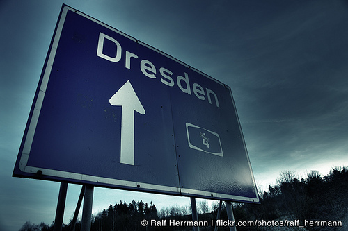
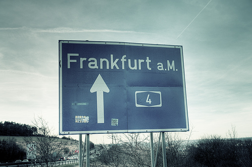
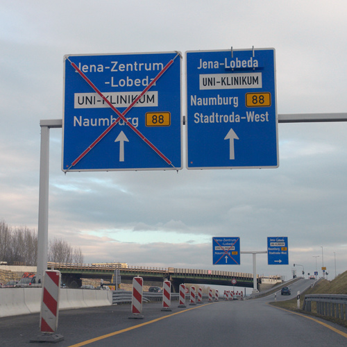
DIN 1451 today
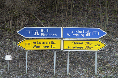
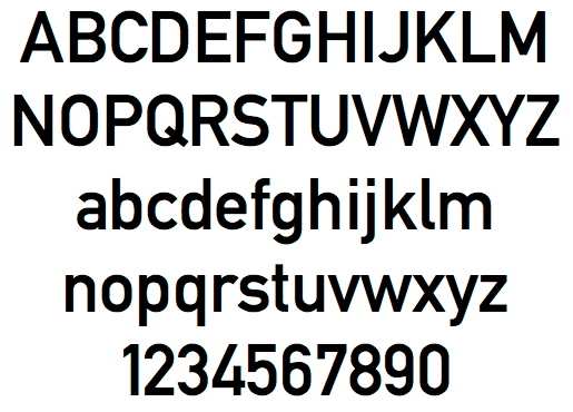
Today two revised styles with typographic adjustments are used. DIN 1451 Mittelschrift is the main typeface:
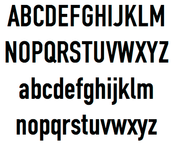
The condensed style (DIN 1451 Engschrift) should only be used when there is not enough space to use Mittelschrift.
Even in this improved design it is still apparent, that these fonts were never made for traffic signs and reading at high-speed in the first place. The weight and the tight spacing is only working well at a close distance.
FontShop offers an extended version of this typeface called FF DIN, which has become very popular for corporate design and advertising.
- Other traffic typeface articles
- Flickr pool Type on Traffic Signs
Ralf, keep up the good work with all of these posts about traffic typefaces from around the world!
Is there any free tech spec for the german signs available on the internet?
Also, what colors do they use? For blue, would it be RAL verkehrsblau?
By the way: East Germany kept DIN 1451 as typeface on their autobahn (motorway) sign posts. The Gill sans type font was used on country roads and within cities.
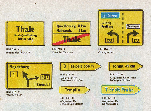
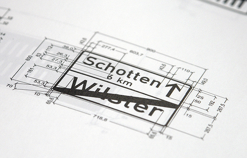
DIN 1451 underwent several changes over the time. The most apparent change in the 1980s were the digits “6″ and “9″. From the old round type (as in the character map in the picture above) from the straight line type version as used in the “Schotten 6 km” sign above the character map. With this newer version, the digits 6, 8 and 9 are easier to distinguish.