Traffic Sign Typefaces: Netherlands
The Netherlands are a special case when it comes to traffic signs…
Until recently the organization being in charge of the traffic signs was the ANWB. It was founded as a Dutch bikers(!) society (“Algemeene Nederlandsche Wielrijders Bond”) in 1883 and later became the royal tourist society.
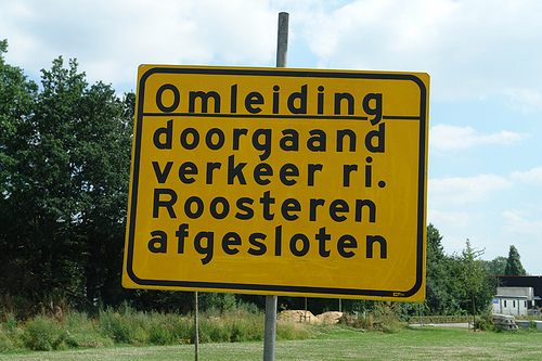
In my opinion these roots are still visible in the design of the traffic signs. On local roads you will see a lot of these sign posts, which are certainly based on the old finger-post signs, used long before the invention of the automobile.
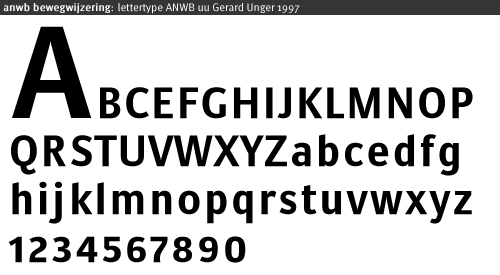
The typeface used since the 1960s is called ANWB-Ee (also RWS-Ee) and it is based on FHWA series E (Modified) from the United States. A condensed version (ANWB-Cc) is also available and it is based on the FHWA series C design.
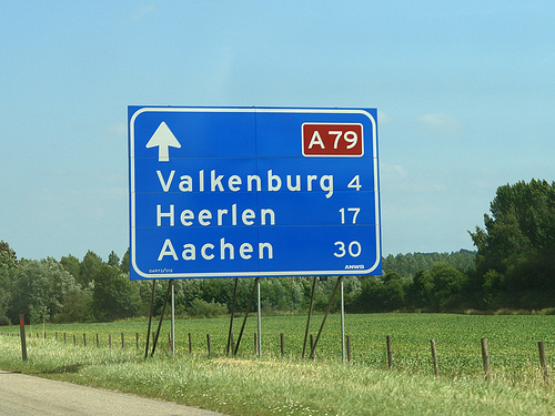
In the late 1990s Gerard Unger was commissioned to design a new typeface called ANWB-Uu.
(source: designworkplan.com)
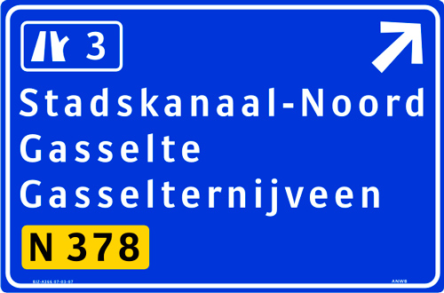
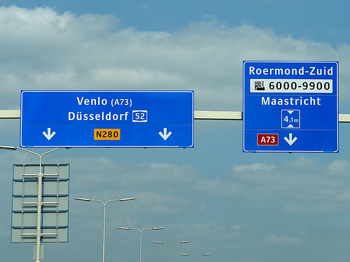
Mr. Unger’s task was to create a font which needs less space to fit the text on the smaller fixed-size direction signs. He achieved this goal. But in my opinion the the briefing itself was wrong. The size of a direction sign must be based on the content, not the other way around! What do you do, if you need to set Gasselterboerveenschemond on such a sign? On top of that, I found these sign posts often mounted at the most unfortunate places, for example behind traffic lights or far away and too high above the ground in the middle of a large roundabout, impossible to read.
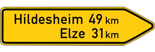
By contrast on a local direction sign in Germany the type size is based on the maximum speed of the traffic at this point and the width of the sign will grow according to the content.
Recently the ANWB-Uu typeface is also appearing on the larger motorway (“autosnelwegen”) signs in the Netherlands, but using only a rather condensed typeface on large signs is usually not appropriate. It would at least need a corresponding version that is not condensed and can be used whenever there is enough space.
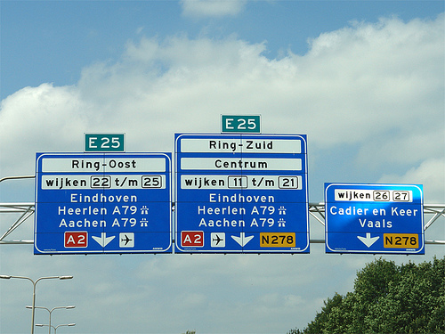
The layout of the signs could also be improved. The signs sometimes appear way too crammed…
or simple but pretty ineffective:
- Other traffic typeface articles
- Flickr pool Type on Traffic Signs
Interesting read, I live in the Netherlands and don’t have any problems with the signage. Highways tend to have a LOT of signage so there’s enough chance to read them (but it could be argued that placing more signage is a solution created by unclear signs).
I do doubt that the last one is an official sign; I think someone made up its own. The text at the right bottom also suggests this: that doesn’t exists for the ‘official’ signage.
Good article but things are about to change in the Netherlands. You are right about the Anwb-Uu typeface being used in not highway signs, but the highway signs are still based on the typeface Interstate. Currently the arrows are changed from pointing downwards to upwards. The design is also changed to more European guidelines in designing road signs.
I totally agree with you on the signs hanging on lighting points, they are very hard to read, too much information and a lighting pole is not intended as a sign. I prefer the German approach where signs are put before you make a decision rather than across the street (the Dutch way). And I believe you are right about the brief to mr Unger, the signs should be redesigned not the only typeface.
Your photo from “Venlo” is not a highway, it is a b-road, the second photo with “Eindhoven” is a highway sign and about to be changed, see image below.
I would prefer to use one typeface for all road signs in the Netherlands (just like the Germans do). Great read, thanks for sharing your information.
Thanks for the update, Sander. Very interesting that they will adapt the German way of using arrows. Although they won’t change all signs at once, won’t they? So this might only add more confusion.
Also the new sign you are showing is not done very well. It is way too small and crammed. Here is a similar sign in Germany.
It has the size of all 3 lanes so it it very clear to which lane every arrow belongs and there is plenty of space for large type and all the necessary information.
Hi Ralf, thanks for adding the image.
I totally agree with you that the signs are too small, all the information is clutterd onto the sign. There is not even a grid to be found in this design. As from my understanding all of the highway signs are changed to this new style, this is based on a survey “Fileproof” where the arrows pointing upwards (like as in TomTom navigation software) speeds the traffic.
The problem with the Dutch is that there is no identity for road and highway signs, everything has been gathered in years without thinking about what is important. There is too much discussion and influences from all parties, which in the end will have a compromised identity.
Last summer I spend in Germany and the road and highway signs are so much better designed and placed. But then again Germany has a larger and wider put up infrastructure than the Netherlands.
What do you think of open or closed arrows? Should the text be centered of left aligned?
Btw, I love your photos!
Well, I think that all features (arrows, alignment, typeface, sizes, borders, text content, colors, materials, …) must be considered within a comprehensive design. There might be good reasons for different arrows or alignments, as long as they work together with all the other features of the design.
Hey Ralf!
Thank you for your great series of traffic sign analyses for a lot of countries!
I’m looking foreward to read some more posts of other country-traffic-signs like from Italy, Greece, Spain or Great Britain and the US.
Greets from Germany,
Toby
Italy will be next.
I didn’t do U.K. and U.S.A. so far, because there is already plenty of information available on these countries.
One thing that is very irritating in Germany are the lights illuminating the signs at night. In the Netherlands these light point upward from the bottom of the sign. What you see as a driver is the reflected light from the surface of the sign. In Germany many, many lights are attached to the top and point downwards. In the dark this results in a very bright spot near the sign, which leads to a very short “blindness.” I find this highly annoying…
I also, personally, don’t agree with the long arrows pointing upward. It takes to much time to deside… The reading direction is always downward for us Europeans.
So what happens in the Netherlands is the following:
At the sign you look for your destination. Say Rotterdam. Immediatly below that—where you naturally expect it—you have a small icon-like arrow, pointing you to the correct lane. I have to admit though that I am a Dutchman living in Germany, and hence be more comfortable with the old Dutch system.
Taking Sander picture of the 3-lane sign A12, A348, it is true that with the upward pointing arrows you can indicate the a particular lane is going to Apeldoorn, and that later on you still have the option to go to Nijmegen because a second lane will appear in the direction Nijmegen.
The purpose of all roadsigns is to inform you almost instantly where to go, and what to do. And to fullfill this purpose without creating ambiguity.
Just my 2 cents from Germany, Marco…
Where do you live?
In my region there are hardly any lit signs left, because the current retroreflective materials make the additional lights superfluous.
Well, I don’t think it’s that simple. Signs are read in different ways and they need to give access to those different ways of reading.
We usually don’t read all the information on a sign from the top left to the bottom right until we find our target. We look for our target where we expect it to be. So grouping the targets with a large arrow might be very helpful to quickly access the information we are looking for.
But then again, what »feels right« is usually just what we are used to the most. And that’s why I am surprised that this very new way of applying the arrows should be introduced in The Netherlands. Even though I like it, it might be rather confusing for the people who are not used to it. And I don’t think that’s gonna speed up the traffic!
The advantage of the German way of doing the arrows is clearly it’s consistency. They don’t change direction just because they are on an overhead sign.
Hi Ralf,
Many thanks for an interesting blog. I’m doing some academic work on Ireland’s dual language road signs (in a bid to improve, or at least draw attention to, the typographic design!).
I like your photos of Gerard Unger’s type in application and would very much appreciate if you’d grant me permission to use them for academic purposes, it would be used to illustrate the Netherland’s solution as one example of international practise. (Of course you’d be duly credited!)
I wonder if you have experienced any interesting dual language examples, good or bad, on your typographic travels>?
Any help gratefully received - and keep up the good work!
Sláinte
Garrett
Hi Ralf
Many thanks for sending me the images, much appreciated!
I’ve been putting together some of my research information into Ireland’s dual language signs in a blog format, so if you are interested, check it out at http://garrettreil.ie/design-research-blog.php
It’s a work in progress, and I’ll add more information as time goes by.
Best
Garrett
You comment on the width of signs in the Netherlands that, “By contrast on a local direction sign in Germany the type size is based on the maximum speed of the traffic at this point and the width of the sign will grow according to the content.”
Yet in your article on German road signs I found this photo of “DIN 1451 today”:
http://farm3.static.flickr.com/2008/2255934862_8fab1a96e5.jpg
Here it looks like “Herleshausen” is a more condensed version of the typeface than the place name below it, “Wommen”, and the signs are all the same width.
I guess these kinds of road sign standards must be difficult to enforce. Just thought I’d point it out