Traffic Sign Typefaces: Italy
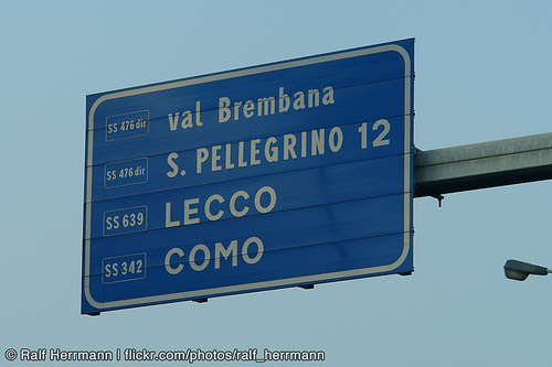
The main typeface used in Italy is called Alfabeto Normale and is a bolder version of the British Transport alphabet. From its use in Spain it is also known as Carreta Conventional or CCRIGE and it is available as Traffic Type Spain from URW++.
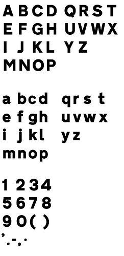
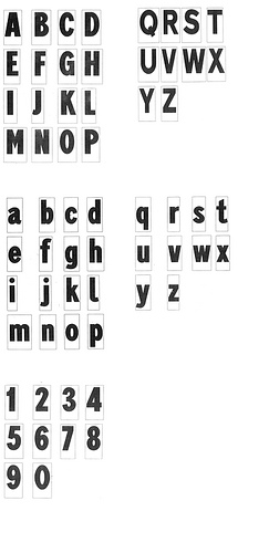
A slightly thinner version is available for white letters on dark backgrounds. But nonetheless both version are way too bold for today’s retroreflective road signs. It’s easy to imagine how the details will get lost when those letters are viewed from a greater distance or when the sign is lit by headlights. This is also true for the condensed style called Alfabeto Stretto, which is also available for positive and negative contrast.
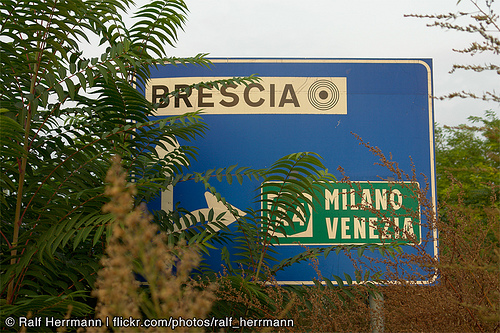
City names are always set in uppercase letters, but I usually didn’t had trouble reading them, since Italian city names are usually short and set in large sizes.
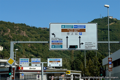
But the overall sign design has many problems. A typical mistake is not to limit the amount of information on the sign. One sign in Italy may present dozens of targets and additional information which are impossible to read even if you would slow down.
")
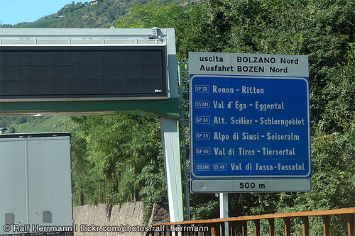
Road numbers are usually very hard to read, since they are scaled down to fit in a rectangle the size of the capital letters.
Another typical Italian problem I encountered was the missing continuity. You might follow a road (let’s say to Venice), but then hit a roundabout where this major target just isn’t listed for any of the available directions. And when it comes to Italian motorways you don’t get a chance to easily correct your direction, since they are all toll routes with very few exits.
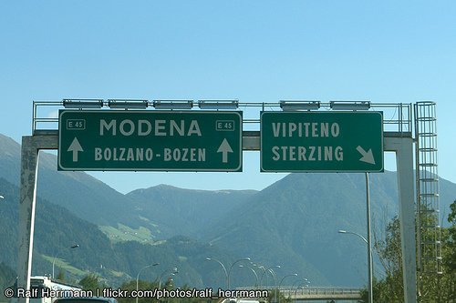
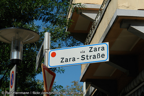
In the northern part of Italy the signs are usually set in German and Italian, but a typeface borrowed from the U.K. obviously doen’t have German letters …
See also:
- Other traffic typeface articles
- Flickr pool Type on Traffic Signs
“Another typical Italian problem I encountered was the missing continuity.” — seems to be a bit of a mediterranean problem (generalizing here) Had this same problem on Mallorca and Gran Canaria. You’re totally out of luck if you don’t know your whereabouts or have a navi.
Photo 5 looks great, that’s pure confusion … for a driver
I have driven a few times in Italy and the road signs are not so good. As said above there is no consistant implementation and often too much information on a sign. I like the Grotesk typeface but if it works for road signs? Maby the signs work for inhabitants but for foreigners… I lots my way a couple of times in Italy, the landscape makes up for it
I live in Italy (but I’m not Italian!!!) and this post cracked me up. I’ve never understood their road signs. “Tutte le direzioni” (“all directions”) is my favorite - but I’ve seen it in France as well - and I swear people don’t see anything wrong with it and don’t understand it when I say it doesn’t make any sense *at all*. Another common feature of their system is two signs for the same place pointing at different directions. Like I always say, Italy is a VERY funny country.
As a side note: I actually met my (Italian) husband partly thanks to the lack of continuity thingie. We were going to the Youth Hostel in Assisi but at a certain point the signs just disappeared, as usual. My friend and I kept walking but had no idea how far we had to go or even if we were going the right way, and looked completely at a loss (not to mention pathetic) with our huge suitcases, lumbering along a narrow road across these fields, the wind blowing madly and a light drizzle falling on our heads. My husband-to-be took pity on us and gave us a ride to the hostel, apologizing for the lack of signs and, well, for most of what I had already experienced in Italy and that doesn’t make any sense to reasonable people… And here I am, 7 years later
Just for info re: >> From its use in Spain it is also known as Carreta Conventional or CCRIGE <<
In Spain CCRIGE stands for Carretera Convencional (Conventional Highway) + Red de Interés General del Estado (State General Interest Network).
I don’t really see a problem with picture #5 (yes, I’m Italian). Unless you’re just wandering around aimlessly, your *will* have some destination, won’t you? Then the sign is to be scanned vertically for recognition of the name of the place you’re supposed to reach. That’s not hard to do, since it’s intuitive that place names are the ones in the biggest format. Road names are black on white and directions towards other towns are white on blue. Easy enough. Once you have that piece of info you simply discard everything on the sides and just pay attention to the spine at the center of the sign, and make sure you’re not in violation of any prohibition, and the reason if need be (“except residents”).
At best, you could remark that the “direction forbidden” sign on the top doesn’t make sense, but that doesn’t have much to do with the objections in this post.
“All directions” does, in fact, make sense. The sign is meant to say that from where you are you can go anywhere. This is not always the case as sometimes there isn’t a straightforward way to go someplace and you have to do a roundabout trip somewhere else before you can see a sign pointing you the way you want to go.
Maybe it’s just a case of no two countries working the same way, isn’t it?
Agreed. But it seems many people don’t get (or learn) what it means.
Most certainly not! This is a matter of human perception and general cognitive abilities. Not a matter of taste or adaption.
I realize we go off-topic with this, but I didn’t mean either. See, what works in a country with, say, a culture for toll-free, no-speed-limit highways like Germany, is bound to be different than what works in a country of long, straight, speed-limited highways like United States, or one where people tend to have to plan their route in advance because of the few exits between two landmarks as is the case in Italy.
In a sense it *is* about adaption, but not of people to weird signs so much as of sign rules to the place and the people reading them.
That probably makes Italian road signs less international and universally readable than they should be, that much I will agree about.
You might also want to check out this thesis by an Italian designer, if your suspicious about my evaluation:
http://issuu.com/berga83
I read a bit of it. It isn’t really at odds with what I say. While trying to make a point about how the signs in Italy don’t really help perception and recognition, he uses *all the time* examples of human intervention to sabotage the effect of not just a bad sign, but any kind of sign. It’s the culture that is wrong, not (just, or per se) the theory behind the signs themselves.
IMO, at least.
I am Italian, driver since 14 years, and I’ve never seen signes like those you posted. The confusing ones are not the rule, but the exception.