Airport signage and cultural differences
Since the middle of the past century, the technical development of our means of transport and associated facilities has expanded to a degree that it is becoming more and more complicated to use. People are more mobile than ever before: they travel from one town to another, from one country to another and from one continent to another, and for this they require instructions for use which suit the particular function. The increasing growth of civil aviation in the 1950s led the International Civil Aviation Organization (ICAO) to comply all typographical signs and issued a study to the needed international requirements of a pictural language understood by various ethnic groups. The sense of orientation alone is no longer enough to find your way in an international airport, also the reception of pictorial, graphic, written and spatial signals is needed. The goal of airport signs & wayfinding systems in airports is to show visitors their way. From finding the toilets, gates, tranfsers or even the coffee corner. Creating a wayfinding system in a airport which will have to guide thousands of visitors takes a in-dept case study of the visual environment, travellers stream, detailed prints of the building and much more.
In his PhD thesis at the University of Lapland (Finland) the German designer Markus Schröppel researches if it is possible to find a common semiotic of pictograms that work across cultural borders. The freeze-framed gestures based on the western way of thinking are often insufficient for international public. The diversity of languages is increasing. The “Council of Graphic Design Association” (ICOGRADA) was to promote international projects for the unification of icons. The “symbol plan” of the United Nations started in 1964 with the call for international and obligatory usage of formulated symbols.
 “The American Institute of Graphic Art” (AIGA) in cooperation with the US Department of Transportation developed internationally recognizable characters which require legibility in varied global cultures and age groups. The International Organization for Standardization, (Geneva), ISO, arranged worldwide test series for the appraisal amongst scientific criteria of the optimal expression in the character in the way of semiotic and pychology of perception. The organisation is monitoring the standard ISO 7001, the standardized “graphic symbols for public information”. In ISO 9186 are all procedures and criteria for assessing and reviewing the comprehensibility of pictograms fixed. To achieve successful passenger orientation, an evaluation of the ease of passenger orientation in the terminal is necessary. It is recognized that the success of the passenger’s ability to locate a facility can be based on a visibility index. Orientation is more than just hang signs and better signage doesn’t just mean better looking signs. Pictograms are supposed to be self-evident, but they produce doubt. The freeze-framed gestures need also knowledge of the western way of thinking.
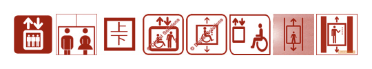
Elevator pictograms: AIGA · ERCO · Japan · Heiko Barmbold · Heiko Barmbold · City of Bruges (BE) · Hansgrohe AG · ISO 7001
Was it a mistake when ISO had defined the present existing worldwide set of icons and related functions, not paying attention to cultural semiotics? Does this indicate a needed change in our cross-cultural communication and does it show a turning point in our future development of the arsenal of iconographic, geometric, linguistic and formal conventions to mediate spatial information into pictorial representation? Markus Schröppel wants to investigate the process of orientation in shared common spaces as well as the individual interpretation of given pictographic (iconic) information in cultural context. Schröppel believes that we have to change the tools for environmental graphic design to create a well-functioning communication. With the focus on visual communication we have to factor also pervasive mobile applications into consideration. We need to overhaul the pictographic expressions. We should take as the standard the one symbol which does communicate the intended meaning most readily to most people.

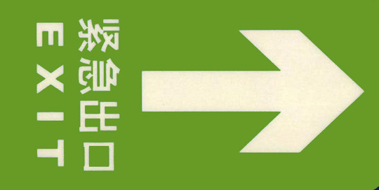
Exit Signs: China National Standards (left); AIGA and DOT—Signs and Symbols (right)
To find out more about this project visit: http://www.airportsignage.de
You can also take part in the questionaire with a comparative test of public symbols.
No comments yet.