Empirical study about the legibility of typefaces used on signs in public space
At the University of Applied Sciences Berlin an empirical study was conducted by Sven Neumann to test the legibility of nine typefaces, including my own Wayfinding Sans typeface.
The use of type in this study was based on the recommendations of the German legibility norm DIN 1450. This ensured that the study reflected a real-world scenario and is suitable for people with normal or reduced visual acuity. 106 participants were tested. They should walk towards the signs using fixed intervals. Once they could clearly recognize the text, the distance was noted.
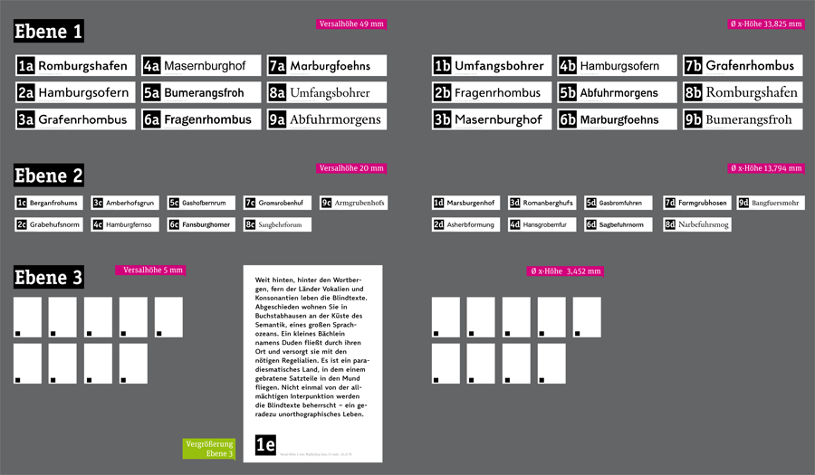
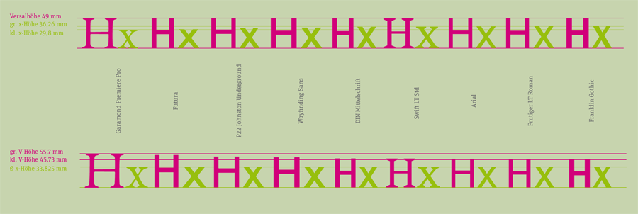
The test included two different type sizes presenting single words and a third test using a small paragraph. In each test the capital height of each typeface was equal, as defined in the current DIN 1450 norm. But the test was also repeated with the same setup, but this time with an equal x-height of all typefaces. This x-height was defined by calculating the average x-height of all tested typefaces.
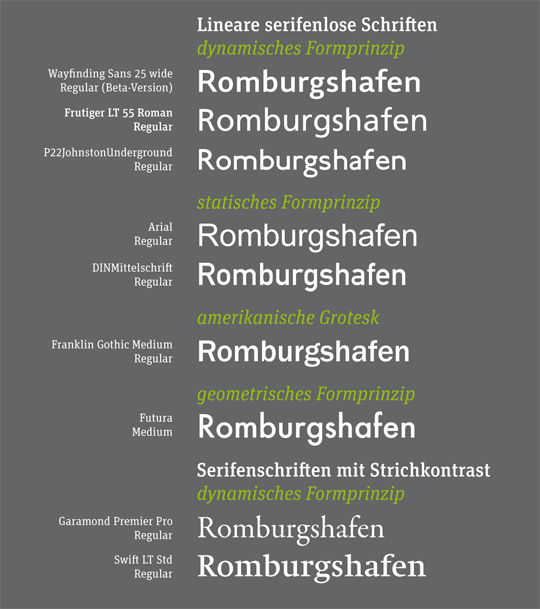
As I have mentioned earlier, legibility studies often just use an equal point size for all typefaces, which does not ensure that the actual size or optical appearance of the tested fonts are equal. But fortunately, this study did’t make this error. The study also uses words and not just single letters, so it tests how information actually appear on signs in public space. The nine tested typefaces were Linotype Frutiger, P22 Johnston Underground, Wayfinding Sans, Arial, DIN1451 Mittelschrift, Franklin Gothic Medium, Futura, Garamond Premier Pro and Swift.
Results & Discussions
The winner of the study is my (still unreleased) Wayfinding Sans® typeface. Sven Neumann writes in his final report that Wayfinding Sans® could be read earlier than any other typeface in all test situations. It was not only more legible than DIN 1451, which is used on the German road signs, but performed even better than Linotype Frutiger, which is one of the most used signage typefaces, especially for airport signage systems.
In the next digram you can see the maximum viewing distances of all typefaces. The dark green bar represents the cap height test and the light green bar the x-height test.
 Of course this result shouldn’t surprise me too much, because increasing the possible reading distance was my main goal all along. But I also noticed, that some people didn’t really trust my design approach which is based on real-time on-screen legibility simulations. They thought it would be too unscientific just to test bad viewing conditions without using certain values. But I know that a typeface created for the worst viewing conditions possible would also perform well under any other kinds of viewing conditions. And now here is the first empirical proof of this idea.
Not surprisingly Frutiger also performs very well. When Adrian finished this typeface in the mid 1970s for the signs of the Paris-Charles de Gaulle Airport he created one of the archetypical humanistic sans-serif typefaces of our time. P22 Johnston Underground is also among the top typefaces in this test. Originally created in the early 20th century for the signs of the London Tube, it might look a bit clumsy today, but works still well in terms of legibilty.
Arial, DIN 1451 und Franklin Gothic Medium achieve just avarage results. Compared to the typefaces discussed above their design is more static and the shapes are more closed, so they don’t perform as well in this legibilty test. Futura performs even worse, because of its small x-height and the geometric design. The serif typefaces Swift and Garamond Premier Pro also perform bad in the cap height test. This comes as no surprise. Their x-height is small and the details are delicate, so they can only perform well under good viewing conditions.
Since the test was performed twice, once with an equal cap height and once with an equal x-height, it is especially interesting to compare the results. Wayfinding Sans® and P22 Johnston Underground with an x-height between 67 and 69 percent perform equally well in both tests. Typefaces with a smaller x-height can only be made more legible by dramatically increasing the point size. But this is often not possible in signage systems were the ascenders and descenders then would conflict with other lines or borders around the text.
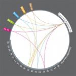
Rather surprising is the good performace of Futura and Garamond Premier Pro when the typefaces are scaled to the same x-height (green curve).
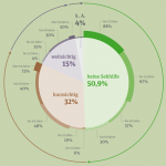
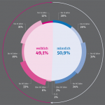
 Not surprisingly, the study also shows a relation of the possible viewing distance to the age of the participants. The group of people under the age of 15 performed the best, the group of participants over 60 performed the worst.
A German PDF with all the results from the study can be downloaded from the server of the university.

Congratulations! It’s a fantastic typeface. And much less boring than Frutiger.
Frutiger is boring, Shaun? Really? Seems you are not very familiar with typography, are you? Sometimes (and the wayfinding typeface is a good proof of it) to be “boring” is the best value of the typeface. But typographers rather use another word, which is “invisibility”. Because a good and legible typeface has to be almost invisible to the reader, who is interested just in legibility, not in fun. Adrian Frutiger knew it. And he made a timeless sans with superb legibility. And probably none of so-called contemporary wayfinding typefaces would even exist without Frutiger.
Brilliant! Congratulations! I can’t wait till you release it. India needs standardization when it comes to signage type.
Oh yes Martin, I bow to your superior knowledge of everything that is type.
Yes, I think Frutiger is boring. I recognize the importance it has had, I just like my typefaces to have a little flavour. That’s my opinion. I was merely paying Ralf a compliment on this superbly designed typeface.
Seriously, what’s with the backbiting? A little camaraderie goes a long way.
Congratulations. However I’m puzzled as to why, in a study on wayfinding typeface legibility, Clearview was not included. Just glancing at it, it seems Clearview has larger counters and x-heights than any of the ones in the study. Shouldn’t it be included?
I’m surprised the study did not include Clearview [1], the new US highway typeface, which was also designed specifically for legibility. No idea if it’s any good, but they definitely did empirical studies to design it.
[1] http://en.wikipedia.org/wiki/Clearview_(typeface)
Yes there are scientific tests for Clearview. For example this one: http://tti.tamu.edu/documents/0-4984-S.pdf
Result: “no statistically significant increases in recognition or legibility distances for any of the Clearview fonts tested”.
And: “the results of the nighttime recognition analysis showed an actual decrease in recognition distance when the FHWA font was replaced with the recommended Clearview font“
I am not saying Clearview is a bad typeface, but it certainly isn’t the answer for every signage project.
Perhaps you should let the Texas Transportation Institute to make a review of your typeface aswell C:
Hello Ralf,
I took a look at this study and the first thing that struck me was that your typeface (WayfindingSans) looks much bolder than the other typefaces.
I remember a writing from Frutiger stating that the “conventional” proportion for a typeface (to use for reading long text) is something like x-height = 5,5 stroke-width.
So I fooled around a little bit with the official pdf from this study and found out that you’re typeface has the proportion: x-height = 4,17 stroke-width. That’s almost 32% fatter than Frutiger measured for the conventional “Regular”/”Book” typefaces. Look here: http://www.linotype.com/793-12660/univers.html (Definition of Medium)
The only other typeface that comes close to this ratio is Futura Medium (x-height = 4,37 of stroke-width), which got the second best result in this study when x-height was the same for all typefaces.
In comparison: Garamond is 5,38 – while Swift is 5,34.
I don’t want to suggest the study was unfair, but I tend to think that your “regular” type is almost “bold” and that this helped a lot in matter of legibility from a distance.
A lot of factors contributed to your typeface being the most “legible” but I felt like this aspect has not been covered in the study.
What do you think? Would there have been different results if the other typefaces were semibold or bold as well? Maybe we should set all type for wayfinding usage in bold now?
Would love to hear your thoughts on this. And keep up the good work, WayfindingSans looks very promising.
Cheers.
This study tested certain font styles as they are. And this is correct from a scientific point of view. All the different features of the different styles add up to create this result. There is no way to remove one, because this is what the “design” of the different fonts is made of.
From my own studies I can say, that the “boldness” of signage typefaces is overrated or even wrong. A more bold typeface won’t necessarily increase the possible reading distance. With more boldness you increase the visibility of the stroke, but you also loose the details of the letter skeleton. That’s why the geometric/grid-based DIN 1451 performs often better than most signage typefaces, even though it wasn’t specifically designed for distance reading.
My guess would be, that bolder versions of the sans-serif typefaces of Frutiger, Arial in this test would not have changed the result much.
On the other hand, text typefaces like Garamond Premier Pro are certainly too light for distance reading. It would have been interesting to see a dedicated Caption (thus low-contrast) style of an old-style typeface in such a test.
>This study tested certain font styles as they are. And this is correct from a scientific
>point of view. All the different features of the different styles add up to create this
>result. There is no way to remove one, because this is what the “design” of the different
>fonts is made of.
Sorry, but I didn’t want to questions the study or its methods; or as I wrote earlier: I do not suggest the study was unfair.
I was merely suggesting that a certain ratio of thickness to x-height might be more beneficial than the traditional one. Just one of the many factors that might or might not contribute to legibility. Maybe something between the usual regular and the usual bold.
>With more boldness you increase the visibility of the stroke, but you also loose the details of the letter skeleton.
I understand, good point. Probably a bold or black typeface will also just get blurry at some point (less whitespace in the letterforms).
> On the other hand, text typefaces like Garamond Premier Pro are certainly too
>light for distance reading. It would have been interesting to see a dedicated
> Caption (thus low-contrast) style of an old-style typeface in such a test.
There is a thread at typophile (Kevin Larson and others were involved) where “agate” versions of typefaces (optimized for legibility in newspaper at 5.5pt!) were suggested – these are highly legible at tiny sizes, so they were wondering if “agate” might be more legible in large sizes than the regular cuts of typefaces.
Anyway, thanks a lot for your statements on this
Hi Ralf, the chart “Leseentfernung in m” is too much of visual rhetorics. I would prefer simple horizontal bars, and showing full scale down to 3, 2, 1, 0 m.
What I find striking about the result is that you get one additional meter out of it, compared to Futura at same x-height. Even more interestingly, it does no less than challenging the claim that humanistic* sans serif typefaces are more readable than the more constructed ones.
* Though I prefer to avoid this term which is not specific enough.
BTW: I wasn’t involved in the study and did not make these charts. They are just taken from the PDF of the final report.
I see. A designer in love with circles.
You say “just taken from”. I would say “made a selection” and a visual statement.
I am really enjoying the Wayfinding Sans and the whole study, but since I read it I am asking myself where the condensed width would appear in this ranking. Because in most of the signage systems the space on signs is limited and many designers might prefer the condensed width therefore. Especially because the Wayfinding Sans Regular seems to be a bit more extended than the others (I compared just a few of the listed using the same x-height). Having the same space on a sign, that would mean a reduction of the size. Maybe with the right factor a comparison of the horizontal metrics based on the results of the vertical metrics would easily be possible. But the missing width thing here still bothers me
As I have said in the comment above: such tests can only test typefaces as they are. They cannot remove all variables of type design (x-height, stroke width, character widths …) because these things make up the design itself.
The use of condensed typefaces on signs is a topic of its own. See also: http://opentype.info/blog/2012/06/07/sofie-beier-about-legibility/
I agree with Sofie Beier that the use of condensed typefaces on signs might not even be desirable and typefaces of regular widths set smaller could actually perform better in terms of legibility. I myself have done all my testings this way – comparing typefaces set when taking up the same horizontal width. In terms of signage this legibility performance based on a given width seems to be a key factor. Since I based my work on these tests, I am also confident, that Wayfinding Sans would also perform well in this regard.
Thanks Ralf for all the hard work that goes into your work, I’ve been following your development for a year and looks like you’ve done a great job in the research and design. As Philip mentions, I too would like to see more studies done on condensed versions for wayfinding. I have worked on a number of Urban Wayfinding projects and the issue with cap height requirements and overall size of the signs is always a challenge as these signs sit in an urban environment and can easily become oversized for the environment. It’s a challenge dealing with traffic engineers who control the state routes through the city and require, in many cases, the same cap height as highway signage. I will look into using your condensed font on the next project. Another font I have found to be a good fit for signage is Whitney, designed by Hoefler & Frere-Jones for the Whitney Museum, at the same cap height & x-height as Wayfinding Sans & Frutiger Next Medium it takes up less horizontal space as does DIN 1450. Thanks again and look forward to working with your font in the future.