Wayfinding observations: Color Coding and Cardinal Directions
In an older post I already talked about the lack of proper information about cardinal directions in modern signage systems. Instead of using the actual words North, East, South and West or showing a compass rose, color coding can also be an easy and effective way to aid orientation.
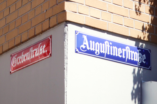
This can be seen in the German city of Mainz. Tourists are often puzzled why some street signs are red and some are blue. In the middle of the 19th century the old and complicated system of house numbers was revised and based on a system that was successfully used before in Paris and Frankfurt. The streets leading to the river Rhine got new house numbers starting with 1 at the river side—even numbers on the right and odd numbers on the left. In addition, streets parallel to the river got blue signs (like the water!) and streets that led away from the river got red signs.

(Image source: Wikipedia Commons, CC BY-SA 2.5)
Once you understand the system, it helps you to keep your orientation while walking thru the city, even though using only two colors instead of four leaves some room for ambiguity, because at junctions the colors appear in the same way at opposite corners.
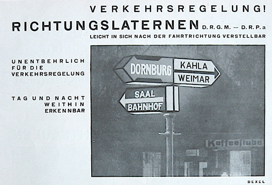
An even more interesting example was developed in the 1920s by the German designer Walter Dexel. In 1925 he installed the world’s first illuminated direction sign in the city of Jena, Germany01.

After some time of experimentation he argued that the color coding of such signs should be based on a normed color coding based on the cardinal directions, like:
- North: white text on black background
- South: white theft on red background
- East: black text on yellow background
- West: white text on blue background
The idea of these directions signs was even patented, but at the same time the German norm system DIN evolved and these regulations were later used thru out Germany. The color coding for the current direction signs is now based on the kind of target.
- White text on blue background: “Autobahn” (motorway)
- Black text on yellow background: out of town target
- Black text on white background: local target
Similar color coding systems are in use for road signage all over the world, but I still find the idea of using color coding for cardinal directions very interesting. Maybe not to replace the established regulations for road signs, but something like this could also easily be included in buildings where signs or even whole walls could be colored to aid the orientation thru cardinal directions. What is your opinion about that? Do you know other examples where color coding is used to show the cardinal directions? Let me know!
- Source: http://de.wikipedia.org/wiki/Walter_Dexel [↩]
That really is a wonderfully useful idea. I have a habit of coming out of metro stations and going in the wrong direction and this would be a good stab at a solution!
Interesting! I would like to go to Mainz to experienced that.
Attaching colour to street names seems like adding another dimension implicitly indicating directions.
The only potential disadvantage could happen on coulour-blinded people. Instead of blue indicating river-parallel, they might see something different and thus have different perception on coulour-coding systems.