99 do’s and don’ts of Wayfinding
The Dutch wayfinding experts from Mijksenaar released an app for iPhone, iPod touch, and iPad, that collects best practices around signage and wayfinding design. The app contains a set of rules-of-thumb and the content of the app is meant to engage in discussion and understanding for wayfinding amongst professionals, designers and novices.
Wayfinding and architecture have more in common than assumed. In order to understand a building, these two disciplines, depend on each other. Paul Mijksenaar says: “The fewer signs the better. This is possible when the designers of our environment ensure that wayfinding in buildings and spaces is intuitive.”
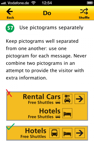
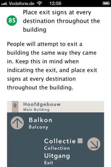
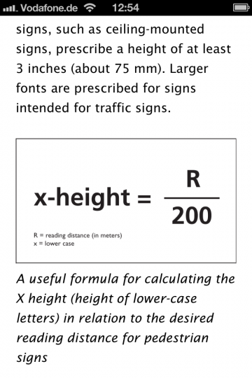
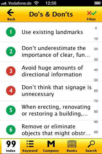
The content is organized into the five main categories: architecture, layout, location, message and systematics. You can explore the 99 entries by their number, by category, via full text search, by chance (shuffle function) or by using the keyword function, which also can be uses as a glossary. The entries are nicely written and easy to understand. Most entries are supported by images from the Paul Mijksenaar Archives. The app is derived from an idea by Paul Mijksenaar and based on a graduation project of Liselotte van Wickeren.
As I had expected in advance, there is not much in this app that would actually require an iOS app. The content could also easily be presented as an (e)book or as PDF. There are no interactive features or location-based services included. But it is still a nice way to explore these best practices of wayfinding design.
The app is available for download (in English and Dutch) in the App Store for € 2,99 ($ 3.99 in the U.S.)
An android app would be nice or the ability to read the same tips on a web site
Yup a good year and a half late but android would be nice