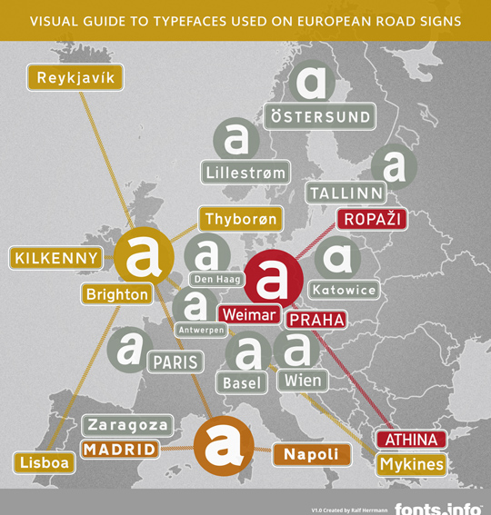
Infographic: Visual Guide to Typefaces used on European Road Signs
I started to design this infographic for a conference talk about European road signage typefaces, but I thought this might also be useful to share with everyone.

The hi-res version (2000 × 2000 pixels) can be downloaded here:
View/download hi-res imageSome notes:
- Each circle in the image represents a unique design. The rectangular signs show how this typeface is likely to be used in a certain country.
- The dotted lines show connections between the typefaces. For example: The British Transport typeface is used in many other countries as well, but is was also redrawn in much bolder version and used this way in Spain and Italy.
- It’s intentional that I did not name any of the typefaces. Sometimes there are official names, sometimes people refer to them by the name of a digitization. And sometimes the fonts are just called “Traffic Alphabet” or just “Alphabet” in the local language. If you want to find out more about the specific typefaces, check my articles in the category Traffic Typefaces.
- The graphic is by no means complete. I only used typefaces where I had access to the fonts or at least vector drawings of the letters. I also did not include bilingual alternatives or older typefaces which might still be present on many signs in a certain country. The graphic should just give you an idea of a typical typeface use in certain regions of Europe and how those designs might be connected.
To help you out:
Slovenia (And I would think most of the Balkans - as in former Yugoslavia) uses the same typeface as you have displayed for Antwerpen. If I recall correctly this is still a former Yugoslavian standard and therefore called Yugo-standard with the distinct, broken lovercase “a”.
But to be more correct about the name and history, I would have to check up on that!
Thanks.
Yes, that font originated in Switzerland, where it is now replaced by Frutiger:
http://opentype.info/blog/2009/04/09/traffic-sign-typefaces-switzerland/
Yes, one and the same!
http://image.24ur.com/media/images/600xX/Apr2009/60276362.jpg