Archive by Author
Traffic Sign Typefaces: Dansk Vejtavleskrift (Denmark)
Posted on 11. Mai, 2008 by Ralf Herrmann.

Denmark is very generous with colors. Road sign can be red on white, white on green, blue on white, black on yellow and white on blue. Red (usually reserved for emergency icons) is the main color, because it is the color of the national flag of Denmark. [...]
Continue Reading
@font-face survey (results)
Posted on 19. Apr, 2008 by Ralf Herrmann.
 The new font embedding feature introduced with Safari 3.1 has already caused heated debates in the type industry. But what do web designers think about it? Do they want to use it? Will they be willing to pay for webfonts? I did a survey among web designers to find out. Many thanks to everyone who participated!
Here are the results …
Continue Reading
The Gutenberg Press
Posted on 18. Apr, 2008 by Ralf Herrmann.
In this BBC broadcast Stephen Fry examines the story behind the first media entrepreneur Johann Gutenberg, to find out how he printed his famous Bibles.
Continue Reading
web font embedding (@font-face) is back
Posted on 03. Apr, 2008 by Ralf Herrmann.
Typographic variety is coming back to the Web. With the release of Safari 3.1 for MacOS and Windows, Apple’s web browser now supports font embedding for websites. Now millions of web users can view websites the way they were intended to be …
Continue Reading
The ABC popup book
Posted on 19. Mrz, 2008 by Ralf Herrmann.
From the lenticular cover that changes with the angle of your hands, all the way to the Z, ABC-3D is as much a work of art as it is a pop-up book. Each of the 26 dimensional letters that move and change before your eyes is a treat. C turns into D with a snap. M stands at attention. X becomes Y with a flick of the wrist. And then there’s U… Boldly conceived and brilliantly executed with a striking black, red, and white palette, this is a book that readers and art lovers of all ages will treasure for years to come.
MARION BATAILLE is graphic and book designer who has never before been published in this country. She lives in Paris. This is just a hand-made mock-up of the actual book which publishes in Oct. 2008.
(via Type for You.)
Continue Reading
Traffic Sign Typefaces: Tratex (Sweden)
Posted on 08. Mrz, 2008 by Ralf Herrmann.

The swedish typeface for traffic signs is called Tratex and was designed by Karl-Gustav Gustafson and modified by Chester Bernsten. [...]
Continue Reading
Traffic Sign Typefaces: Trafikkalfabetet (Norway)
Posted on 01. Mrz, 2008 by Ralf Herrmann.

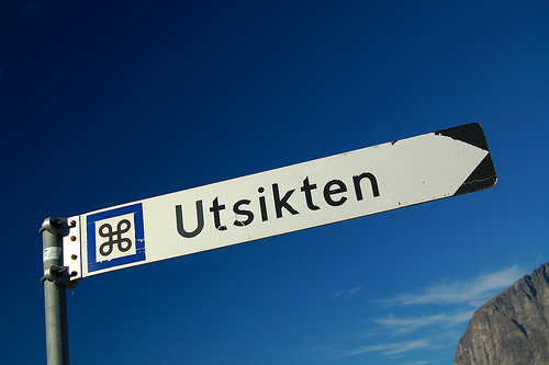
The typeface on the traffic signs of Norway is called Trafikkalfabetet and was designed in 1965 by Karl Petter Sandbæk.

Continue Reading
abcdefghijklmnopqrstuvwxyz
Posted on 26. Feb, 2008 by Ralf Herrmann.


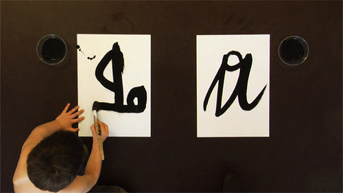
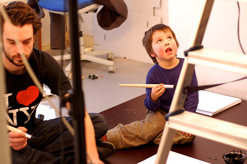
“Job and Gradus are both ambitious concerning letters”. Watch the two brothers writing the alphabet with a brush. A wonderful piece about the development of the personal handwriting.
http://www.xelor.nl/
Continue Reading
A new typography term
Posted on 20. Feb, 2008 by Ralf Herrmann.
keming. noun. The result of improper kerning.
A fantastic idea by David Friedman.
(via FontBlog)
Continue Reading
Typographic stickers for you home
Posted on 19. Feb, 2008 by Ralf Herrmann.
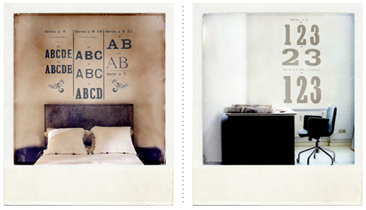
Harmonie Intérieure offers large typographic stickers which you can easily put on your walls. You can choose from 58 colors to match your interior design.

 Follow me on Twitter: