Wayfinding observations: Separation slows down perception
Wayfinding signs can have various shapes and layouts. For example, German road signs fall in one of those four categories:
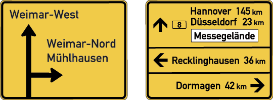
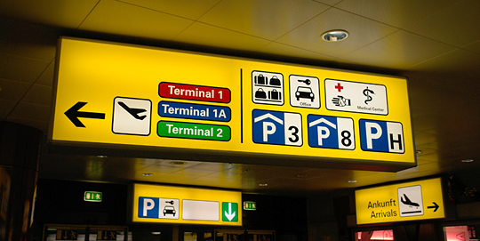
left: compact direction sign, right: compact table sign
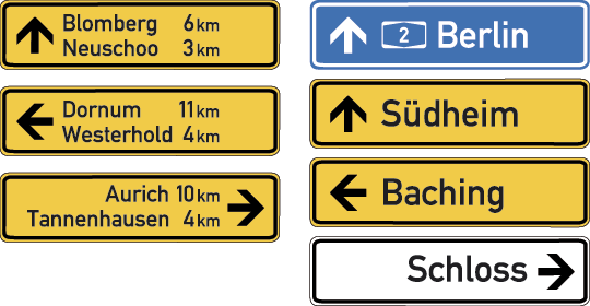
left: partly-separated table sign, right: separated table sign
The amount of separation increased on these sign types. On the first sign, all targets are presented together, on the last sign, every target has its own sign. But which one is most effective? On which sign can we find our target as fast as possible and without making mistakes?
In his diploma thesis Dr. Raoul Bell researched this problem. He conducted a series of tests: In one of the tests probands were presented with signs like these and should look for a certain word and also state the direction of this target.
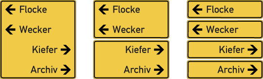
The study found that the type of sign significantly influences the time we need to find the target. When all information were presented on one sign and without any separation, the targets could be found much faster. Bell argues that we perceive these objects as groups and only one group can have our attention at a time. So if the information is split into several groups we need to shift our attention from one group to the next, thus need more time to perform this task.
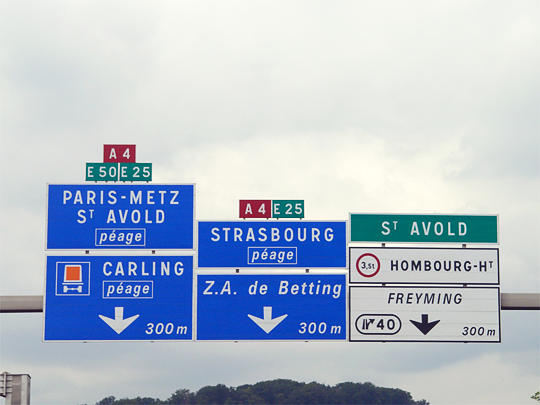
This corresponds to my experience when using road signs. I am used to the very clean and unseparated motorway signs in Germany, but for example these separated French road signs make it really hard to find a target.
Of course these findings are by no means limited to road signs. They are valid for any kind of signage. So wayfinding designers should carefully think about how many separating signs, lines, boxes and colors are really necessary.
The full research paper (German only) is available here: Objektbasierte visuelle Aufmerksamkeit: Relevanz für das Design von Verkehrsschildern
.
Nice insight Ralf, I tend to agree with you on seperating the information which takes more time to read and understand, but I also strongly believe that placement is on of the more important issues to addres when it comes to road wayfinding.
In The Netherlands the road signs are changing to a new layout (arrows pointing up instead of down). But on many new signs I still notice too much usage of different layout.
Would be interested in a translated version of the book or a summary of the thesis.
Agreed. The thesis also mentions the importance of Gestalt Psychology like the law of proximity which is certainly essential for wayfinding.
Thanks for the image! It shows another typical road sign problem in some countries: redundant information. All information except the ones for the exit form one group. Repeating the route numbers for every lanes makes no sense and only leads to a information overload.
Thanx for the article. The many groups example does feel slower, there are so many “barriers” the eye need to cross from one word (sign) to the next. Lines are walls.
It would be interesting to see how this impacts web design, which parts are better left grouped or separated.
Ralph, thanks for sharing this. Interesting proposition. It may be true in some cases more than in other. Using your example, it may be the case that French motorists, who are used to their road signs being fragmented may find it difficult to adjust to the German ones where all the information is grouped. It may be that they’ve evolved a better ability to “skip-read” and ignore the separation, just like many people have learnt to ignore banner adds on websites and ads in newspapers. Or perhaps they’ve evolved the ability to devote their attention to more than one group at a time. Conditioning of participant to a specific modality of information presentation may play a significant role in the outcome of any such research. Does the research paper indicate whether the test subjects were all German?
Does the German research paper indicate how many milliseconds the writer considers to be a “significant” time difference and how many milliseconds is “much faster”?
Great article Ralf. Please, let us know when the research material will be available in english.
I’m German and have lived for some time in the UK and also France. I find French road signs the least clear, but I think this is due at least in part to the fact that they use ALLCAPS for the lettering of city names. This makes it more difficult to quickly scan for a word shape.
Great post. totally true that it is easier to read grouped sets of info on a single sign rather that separated ones.
Thanks for sharing.
I’m curious which group read the slowest. Regarding the three examples pointing to Flocke, Wecker, Kiefer, and Archiv - It seems to me that the 4 separate signs would read quicker than the signs that are separated into two groups, with two items on each group.
When I was in college, we discussed a similar idea, known as mapping. The argument is that a ‘natural’ mapping is easier to understand than an ‘arbitrary’ mapping - though they gave me little basis to quantify this. I believe this would fall into those categories - the first picture (where the items are all grouped together) seems to be a ‘natural’ mapping, and the second picture (with the half and half split) seems to be an ‘arbitrary mapping, with the third being somewhere in between.
Interesting area of study
The test found that the second and third sign were read significantly slower than the first one, but between the second and the third there was not much difference.
Great article! Please send me an email once the full research paper is translated to english
Bit late to the party but I have another question:
Did the study test whether it is better to have one arrow for each item or only one for each direction?
In the above example, one could leave away the arrows next to Wecker and Archiv, grouping Flocke/Wecker and Kiefer/Archiv, with one arrow each. I heard that this kind of grouping makes it even faster to pick up.
I agree. But that would not only be a question of “arrow or no arrow” but most importantly how all the items are placed and spaced to make the grouping as clear as possible.