Kerning and OpenType features in Firefox 3

Firefox 3 will be the first major browser with support for kerning and automatic ligatures. I tested the Firefox 3 release canditate and I have to say, it’s not perfect yet. But first the good news:
Kerning
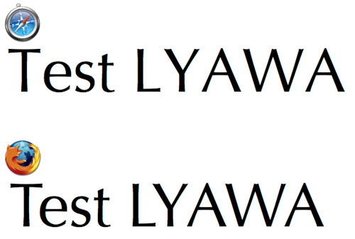
Kerning is an important feature in print typography but for most of the (rather small) texts we read on the screen it is no big deal. But for larger headlines and print-outs it’s really nice to have support for kerning. See this comparison between Safari 3 and Firefox 3:

The Webkit developers claimed they have turned off kerning to avoid performance issues. But Firefox proves it can work.
Layout Features
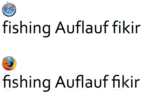
Firefox 3 supports a few layout features of fonts with OpenType or AAT (Apple Advanced Typography) tables. The most obvious one is basic ligatures. In this example you can see the typical f-ligatures that are common in latin fonts and are now used by default in Firefox 3, if the font supports this feature.

This is nice for webpages in English, but it doesn’t work in all languages. For example, in German the use of ligatures depends on the words. “Auflauf” is a word where a ligature is wrong. In Turkish such ligatures are not used at all because they would lead to confusion between the characters “i” and “dotless i”. The logic for dealing with those exceptions is usually built into the OpenType fonts, but Firefox doesn’t honor them.
Discretionary ligatures are optional ligatures. The application should turn them off by default and the user might activate them for setting a fancy headline. Unfortunately, Firefox has turned them on by default and this could really mess up the body copy of websites.

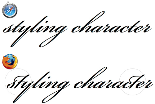
But it gets worse: Firefox 3 also applies ligatures that are only valid in a special context, for example the end of a word.

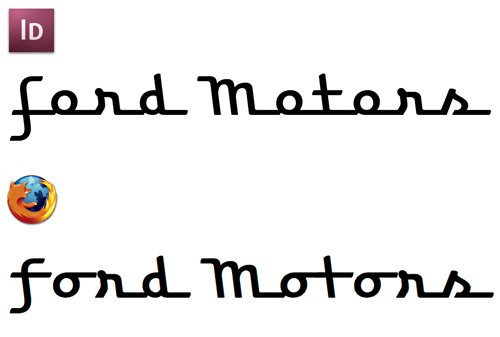
Firefox doesn’t seem to check for context-dependent replacements. Which is a great pity, because this is the real power of OpenType layout features. See this next example:

A script font like that relies heavily on contextual replacements. Without support for Contextual Alternates and Contextual Ligatures such a font is almost useless. Most standard system fonts may not require such OpenType features, but when downloadable webfonts will someday be available in Firefox those features will hopefully be supported.
The kerning support will hopefully set an example. But the current use of OpenType features in Firefox 3 is rather disappointing. When ligatures are thrown in that are wrong in the used context or language, I would rather see no ligatures at all.
Thanks a lot, Ralf, for this interesting test run.
If language-dependency is a problem, just declare the language of text. Why not run a few test cases?
I would also compare Opera. It exists, you know, and does many of the same things (many).
Done. I tried setting a global language for the document and a local language for a p tag. Firefox doesn’t honor the ligature exceptions built into the font.
I just used Safari as an example of all the browsers not supporting kerning and OpenType layout features. At least in the above tests Opera produces exactly the same results as Safari.
Thanks for putting this together Ralf!
Ralf, what are the fonts you’re using for your tests here? And I’m guessing you’re running your tests on OS X - 10.4 or 10.5?
Fonts from top to bottom:
-Bickham Script Pro
-Optima (Mac dfont)
-Corbel
-Bickham Script Pro
-Bickham Script Pro
-(unreleased font)
Yes it was done on OSX (10.5). I just tried the FF3 RC3 on Windows XP. It doesn’t have these ugly ligature bugs. Just the mentioned problem of not honoring the language-specific exceptions.
And even the contextual substitutions work! Wow!
Thanks for the illustrations. Say, how do the ligatures affect quick find searching and general search engine indexing of websites? I imagine that indexing isn’t affected at all but does the Firefox quick find really break the ligatures down to their composites? If not, this typographic feature seems quite counter productive to me …
Regards, Tyll
Tyll,
I haven’t tested it in every detail, but I am pretty sure the ligatures don’t affect the underlying text. Indexing and copy&paste should work like the ligatures weren’t there at all.
Whoa, you’re quick, thanks. Maybe you could post a follow up with examplary websites that actually use OpenType fonts where we can see the new feature in action … I couldn’t just now find a site that uses OpenType fonts, until I checked out Joe’s fawny blog from the comment above with FF3, where the hyperlinks are set in Candara, which seem to have a fi-ligature (while the Cambria of normal text doesn’t). Now, the fi-ligature behaves just like normal text, no problem with the quick find. Great!
It’s a step in the right direction for sure. Firefox 2 was surprisingly poor at rendering typography.
Thanks for posting your analysis!
We use the platform’s native OpenType support for all of these features. On Windows, Uniscribe & friends do a good job of doing the right thing; under OS X, we’ve had to fight with ATSUI in many circumstances. Obviously, we haven’t quite won yet Probably some further configuration is required, but it’s also complicated by the obsoleteing of ATSUI and the introduction of Core Text in 10.5. We have people who are very interested in typography, so these are definitely things we’ll be working on!
unfair test, we all know firefox is the best.
Ooo… That’s interest. Thank for make compare.
We are also interested in eventually adding kerning and ligature support to WebKit (possibly only at larger font sizes, since the benefit at smaller font sizes is not worth the performance hit).
I would love it if you could make your actual test cases available for download. This would help both WebKit and Gecko developers as we work on better typography support.
We use the platform’s native OpenType support for all of these features.
… so this varies from platform to platform? Would be interesting to see linux vs. windoze vs. OSX.
On linux, I note that ligatures seem to work “better” overall than the OSX examples, but their subpixel/antialiasing is quite annoyingly off - e.g. “off”, the ff is rather lighter than the o, the stems of the ff are ~ 2-3 subpixels thinner than an “i” stem. No idea how much of that is font bugginess/misdesign, how much engine bugginess and how much firefox bugginess, but it’s annoying me to the point I’m considering turning ligature support off (at least if I can work out how to).
great stuff.
Very interesting, thank you.
So…. How do I test this myself?
Here’s a quick test case I made
http://mymapofjapan.com/styles.html
Not sure about all the font names, and I used some extras. Probably only works on a mac unless you’ve installed the fonts I used.
These additions would certainly be more useful if both OS X and Windows shipped with more “shared” typefaces that designers could tap into. Here’s wishing those Vista typefaces some day make their way across the pond. There are some nice humanist sans in there.
Ralf, are you sure about the discretionary ligatures being used and the Bickham Script “something” example? I can’t reproduce it with the released FF 3.0/Mac.
I heard the worst of those bugs were fixed in the final release. My test were with FF 3 RC3 on Mac.
Ralf, this is a great visual comparison. Thanks for the information. using the icon above the example text is a great visual device as well.
Wow. How do I write text with “ligatures” on my webpage?
Hrishi - you don’t, that’s the whole point, the font you use just does it automatically, assuming it has the ligatures built in.
FF3 RC3 == FF3 Final. So if it’s fixed in the final release it’s fixed in RC3. Since RC3 was only one bug fix (FF3 crashing a lot on the Mac) you can even say it was fixed in RC2. Mostly problems in FF have to do with a faulty profile or some extension messing up.
I’m sure I’m not alone in this. I’d like for Firefox to use more discretionary ligatures, particularly looped “sc” and “st”. In Libertine, these are grouped in “hlig”, where the regular ligatures are in “liga”. Can I persuade Firefox to use them? I would happily build Firefox (actually Iceweasel, on Debian) by myself, if necessary.
Hint?
Those things cannot be on by default! We would need some CSS properties first, to control these OpenType feautures. So this should rather be proposed to those guys.
In order to control kerning and ligatures Mozilla introduced the CSS property
text-renderingin Gecko 1.9 (Firefox 3). See developer.mozilla.org/en/CSS/text-rendering.Double WOW 2 your design!
A very very nice site with helpful informations! So keep up the good work - I already added the site to my personal favourites. All the best!
I’d just like to thank you for taking the time to create this internet website. It has been extremely helpful
Does Firefox support class kerning for TTF, or only flat “kern” table kerning?
OT kerning should work. See this test font: http://webfonts.info/wiki/forum/viewtopic.php?f=5&t=7
(But it was CFF though)
Yeah, CFF is a different case. For example, the ATM driver on Windows translates OT-CFF class kerning to flat kerning behind the scenes (but only for pairs in WinANSI+MacRoman). I’d want to see (or hear of) it working in TTF to be sure….