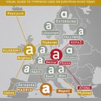
The old Swiss traffic sign font is called SNV (“Schweizerische Normen-Vereinigung”). It is a very geometric typeface with obvious legibility problems.
Traffic Sign Typefaces: Switzerland
Typography
The old Swiss traffic sign font is called SNV (“Schweizerische Normen-Vereinigung”). It is a very geometric typeface with obvious legibility problems.
Do you know your VAG from your Bembo? Play the font game …
The Periodic Table of Typefaces presents 100 of the most popular, influential and notorious typefaces today. The selection is based on several font rankings including our Top 100 fonts from FontShop Germany where I was part of the jury. via L’Aureola
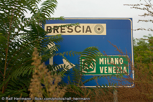
The main typeface used in Italy is called Alfabeto Normale and is a bolder version of the British Transport alphabet. From its use in Spain it is also known as Carreta Conventional or CCRIGE and it is available as Traffic Type Spain from URW++.
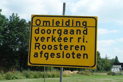
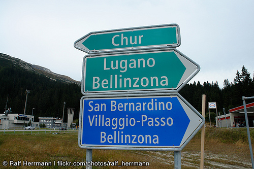
The Netherlands are a special case when it comes to traffic signs…
As part of the new brand identity of the Dutch government Peter Verheul designed a custom typeface for all forms of visual communications. Read about it in Sander Baumann’s weblog.
An interview with František Štorm, type designer and founder of the Storm Type Foundry in Prague: