
 Follow me on Twitter:
Archive for 'Fonts'
Posted on 05. Aug, 2008 by Ralf Herrmann.
Safari and Internet Explorer already support it*. Firefox and Opera will get it soon: Downloadable webfonts. Here is a collection of 10 great headline fonts you can embed in you website free of charge …
Continue Reading about 1. Graublau Sans Web
Posted on 05. Jun, 2008 by Ralf Herrmann.
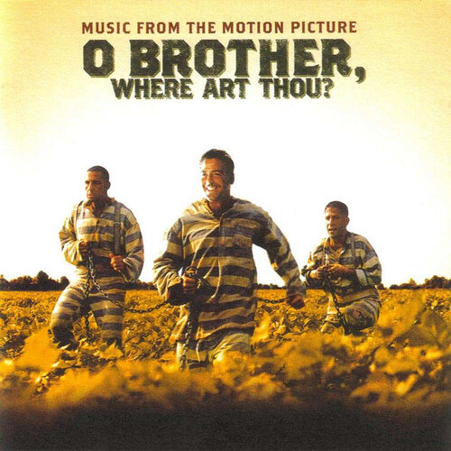
Which typeface could I use for the movie “O Brother, Where Art Thou?” Maybe Emigre’s Brothers?
Designing a logo for the “Hotel Broadway”? Let’s try the font Broadway!
Yes, that’s certainly a “Lack of typographic Imagination”! Stephen Coles (typographica.org) and Ivo Gabrowitsch (fontwerk.com) created the Flickr group LTypI to collect these hilarious font choices.
Continue Reading about Ralf Herrmann: Wayfinding & Typography- Join the LTypI now!
Posted on 14. Mai, 2008 by Ralf Herrmann.
Embeddable webfonts (as introduced with Safari 3.1) are not just about using fancy fonts on web pages. It also opens new possibilities for using glyphs that are simply not available in the standard system fonts. Let’s say you are a linguist or archeologist and wan’t to set an ancient text and you need characters that are not available in Arial or Lucida Grande. Putting little images inside the text was the only way to do it – so far. But the images wouln’t scale and copy & paste of such a text wouldn’t work properly. But with webfonts you could do those things smoothly – and much more. Here are two examples …
Continue Reading about Replacing single glyphs with alternates
Posted on 19. Apr, 2008 by Ralf Herrmann.
 The new font embedding feature introduced with Safari 3.1 has already caused heated debates in the type industry. But what do web designers think about it? Do they want to use it? Will they be willing to pay for webfonts? I did a survey among web designers to find out. Many thanks to everyone who participated!
Here are the results …
Continue Reading about What kinds of websites do you design?
Posted on 03. Apr, 2008 by Ralf Herrmann.
Typographic variety is coming back to the Web. With the release of Safari 3.1 for MacOS and Windows, Apple’s web browser now supports font embedding for websites. Now millions of web users can view websites the way they were intended to be …
Continue Reading about Ralf Herrmann: Wayfinding - web font embedding (@font-face)
Posted on 18. Feb, 2008 by Ralf Herrmann.
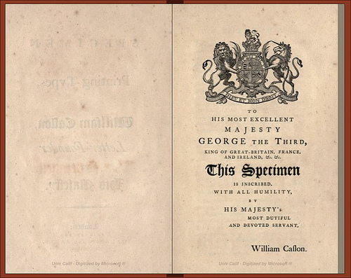
Collecting rare specimen books from type foundries can be a really expensive hobby. Luckily there is a growing number of digitized type specimen books available online. The Open Library project offers a free and enjoyable way to browse in those books. The magnifying glass isn’t working yet, but you can download most of these type specimen as PDFs with a sufficient resolution. Here is a selection of the available type specimen books:
William Caslon – A specimen of printing types (1785)
Continue Reading about 26 Comments
Posted on 09. Feb, 2008 by Ralf Herrmann.
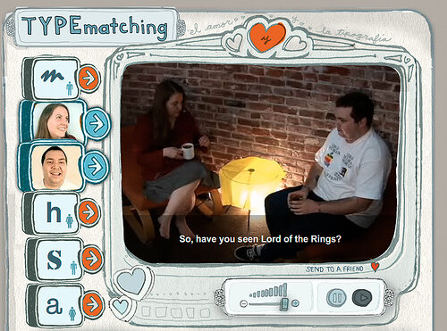
TYPEmatch(mak)ing, originally uploaded by www.typografie.info.
Send two of six well-known typefaces on a date and see if they are a match:
http://blog.extensis.com/typecaster/
(Via Typblography)
Continue Reading about Ralf Herrmann: Wayfinding & Typography
Posted on 31. Jan, 2008 by Ralf Herrmann.
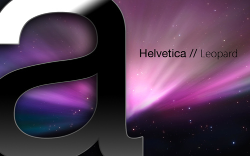
For many years professional graphic designers are used to replace the Helvetica system fonts on the Mac OS with a Type1 version. But with Leopard this seems to be impossible. Whenever you delete the fonts, they will be reinstalled after you reboot the system and you will get a lot of annoying font conflicts.
I looked at several weblogs talking about this issue and they all make a lot of strange statements. So time to shed some light on this subject.
Continue Reading about 42 Comments
Posted on 25. Jan, 2008 by Ralf Herrmann.
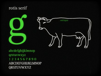
Auf der Homepage von Ralf Lobeck finden sich einige interessante Motion-Graphic-Arbeiten, die beim letzten TDC das Prädikat »Selected for Typographic Excellence« abstauben konnten. Die Filme unter dem Motto »Your favourite type in motion« enstanden als studentische Arbeiten an der Bergischen Universität Wuppertal.
Anspieltipp: Rotis, Meta und Typestar.
Und ich frage mich immernoch, wann die Schriftanbieter endlich aus ihrer Fixierung auf Drucksachen ausbrechen und audiovisuellen Medien endlich für sich entdecken.
Continue Reading about Your favourite type in motion
Posted on 12. Dez, 2007 by Ralf Herrmann.
T.T.F., O.s.F. und A.T.M.,
E.X.P., F.O.N. und U.P.M.,
P.F.B., P.F.M. und C.I.D.,
P.U.A., O.T.F. – ojemine
Aus den typografischen Abkürzungen, die Grafik- und Typedesigner heute täglich benutzen, lässt sich leicht ein neuer MFG-Song für die Fantastischen Vier entwickeln. Derzeit besonders in aller Munde: OTF. [...]

